Process and Approach:
01 _ Understanding
. Business needs
. Problem statement
. Challenge
. Insights
02 _ Exploration
. Guidelines
. Content Strategy
. Wireframing and iterations
. Refinements
03 _ Final Products
. Landing for AdWords
. Homepage A/B testing
. New Rinse Homepage
. Conclusion
Since 2013, Rinse has been revolutionizing laundry and dry cleaning services with a seamless pickup and delivery model across major U.S. cities.
In 2023, we embarked on a project that evolved from optimizing Rinse's AdWords landing pages to creating their new homepage. This initiative, driven by the collaborative effort between Rinse and Lunte Studio, aimed to enhance customer conversion funnels and improve overall efficiency. As a product designer at Lunte Studio, my primary objective was to align our design solutions with Rinse’s goals.
. Business needs
Implement updates and enhance digital products for campaigns to boost market presence and meet user needs more effectively.
. Problem statement
There is only one template used for all Google AdWords campaigns, and no specific content is generated for each campaign.
. Challenge
Design a new campaign template that can be easily configured as per the content requirements. Our main goal for this project was to increase customer conversions and decrease CAC.
In terms of design and UX, we aimed to reduce cognitive load and streamline content.
. Users Insights
62%
of users access ads from mobile phones, and 37% from desktops.
63%
of the main audience consists of women.
25 - 44
is the age range of our largest audience.
. Benchmark Insights
Clean, focused, distraction-free sections.
Highlight the service features in a simpler way.
Social proof to highlight the extra value of the service.
Modular design to be applied as required.
. Guidelines
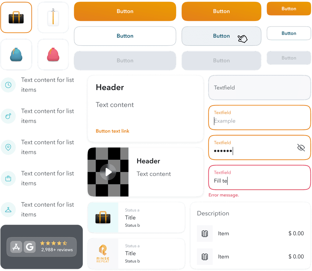
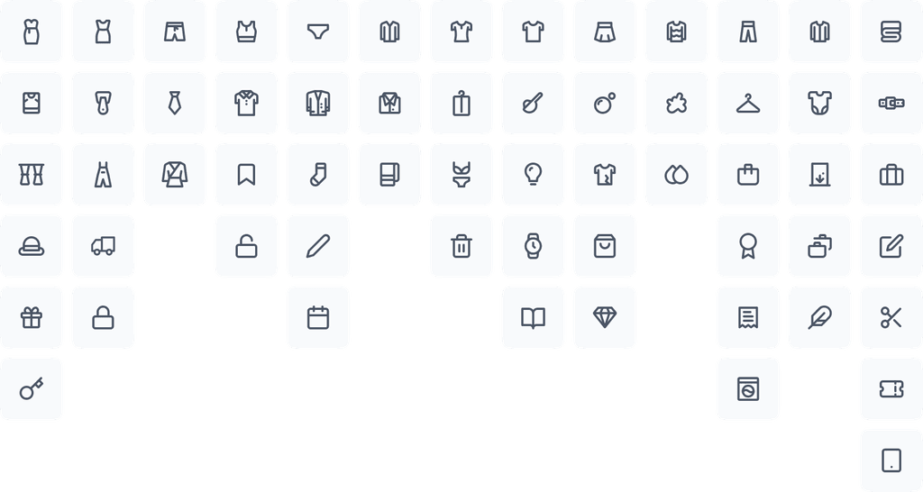
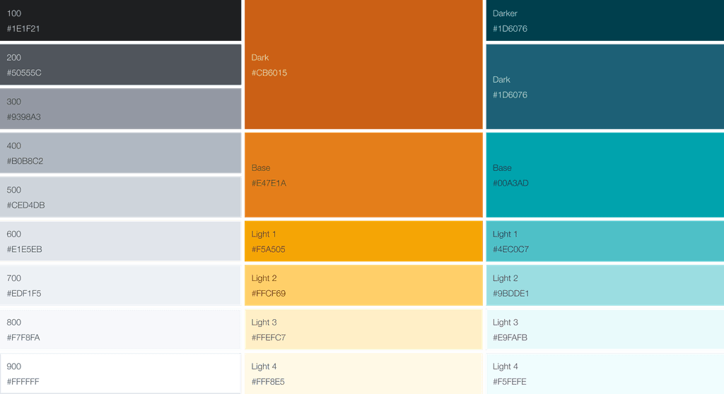
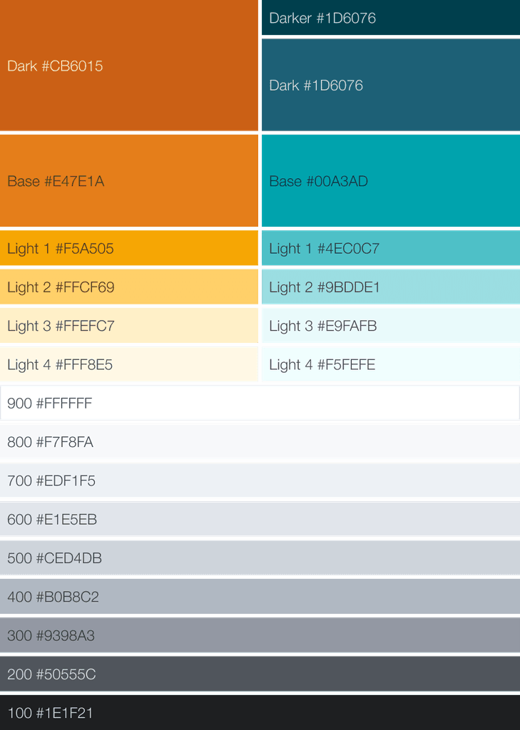
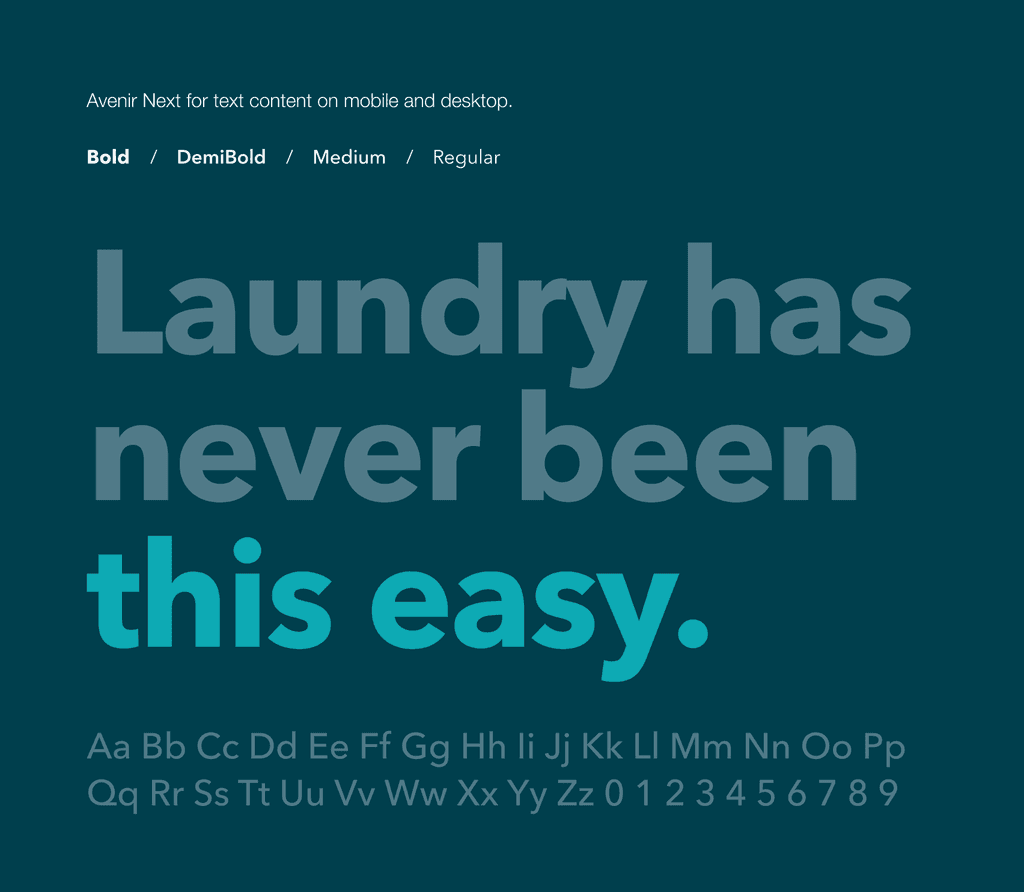
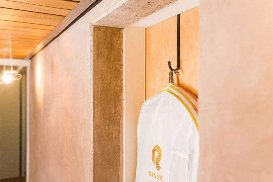
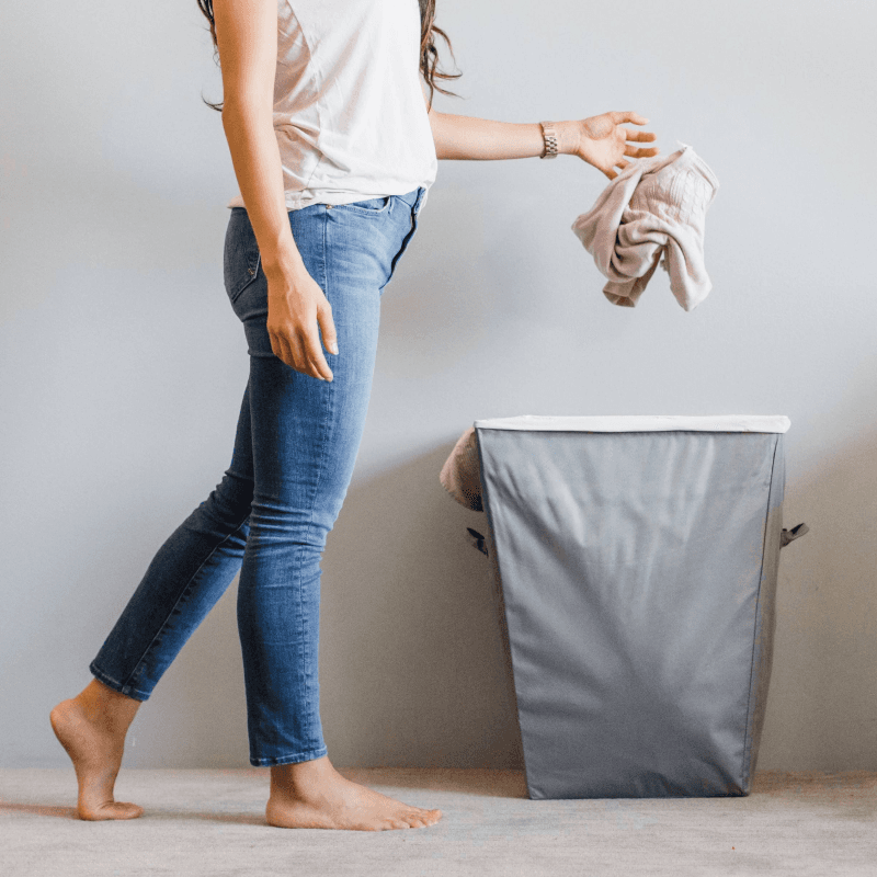
The evolution of the project followed the design guidelines established for Rinse, requiring adherence to its assets, colors, typography, and photographic content.
. Content Strategy
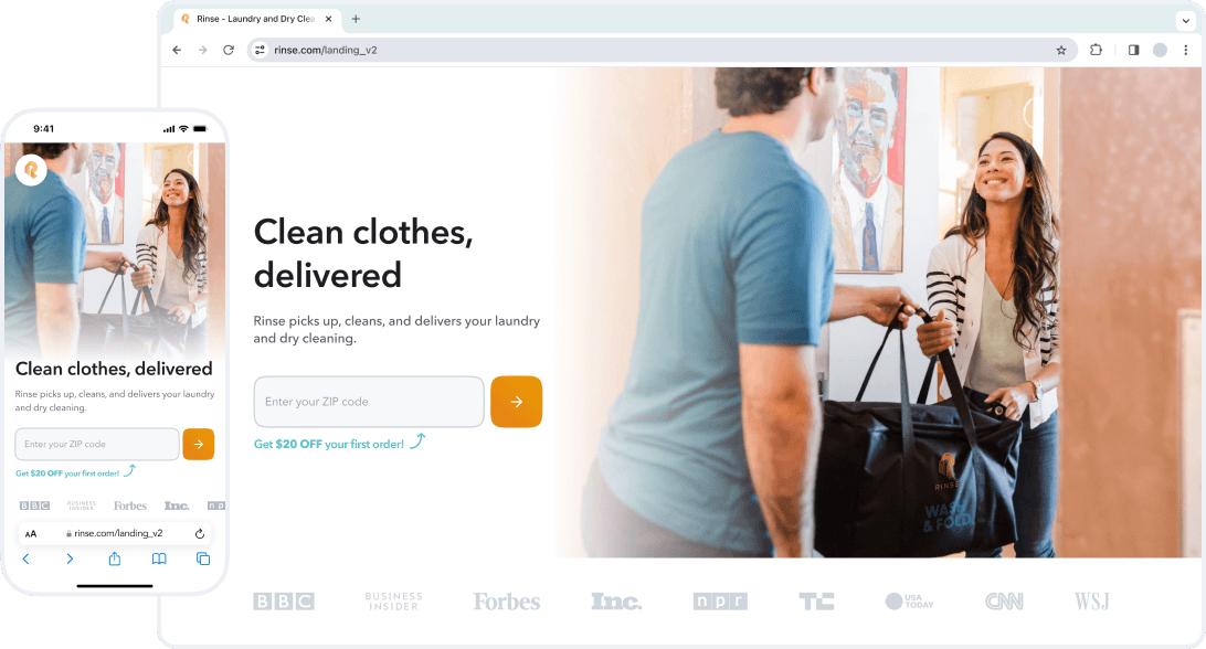
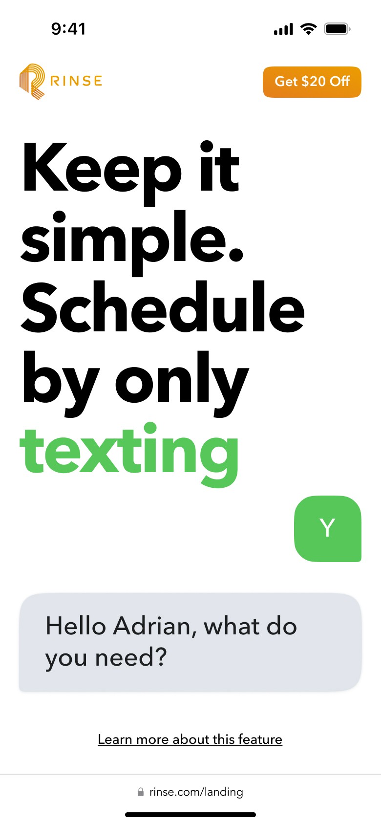
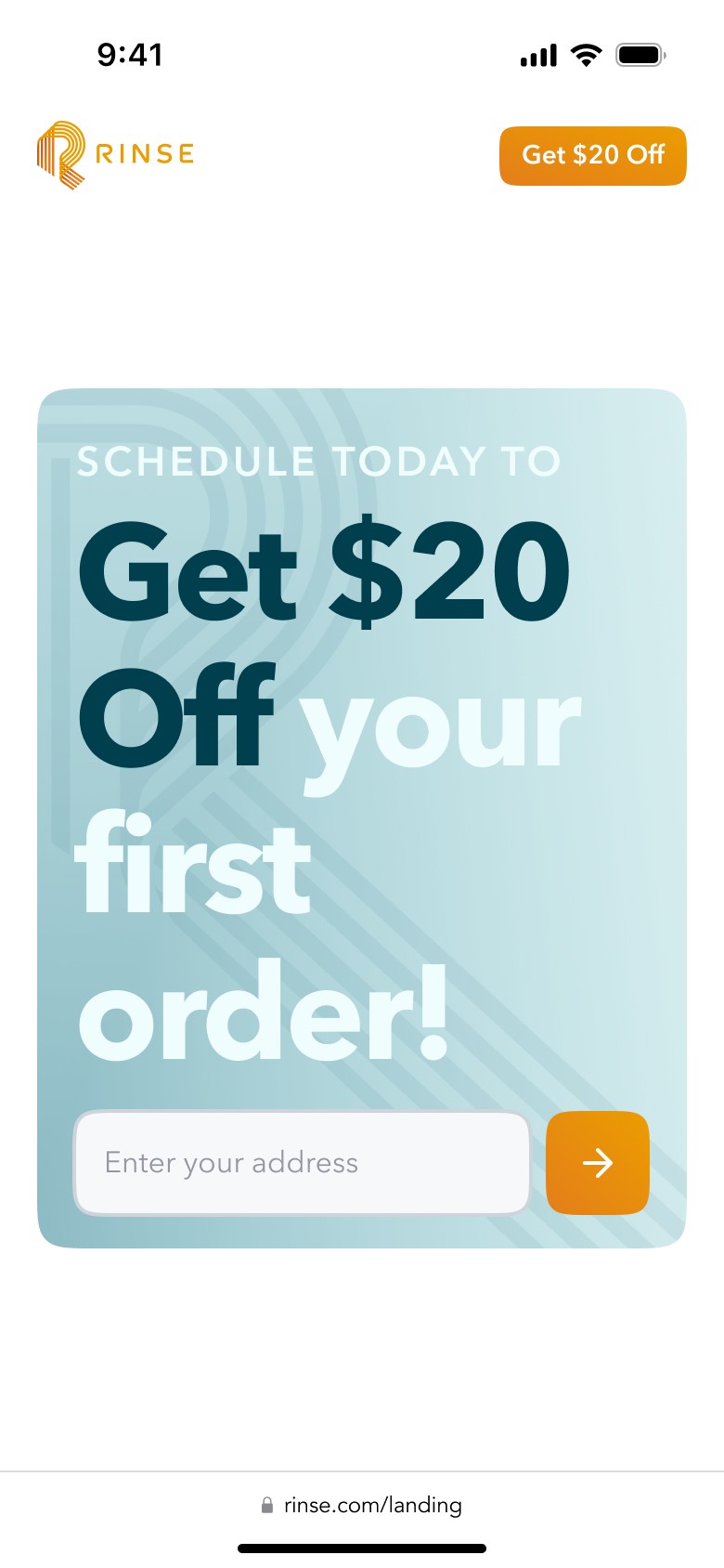
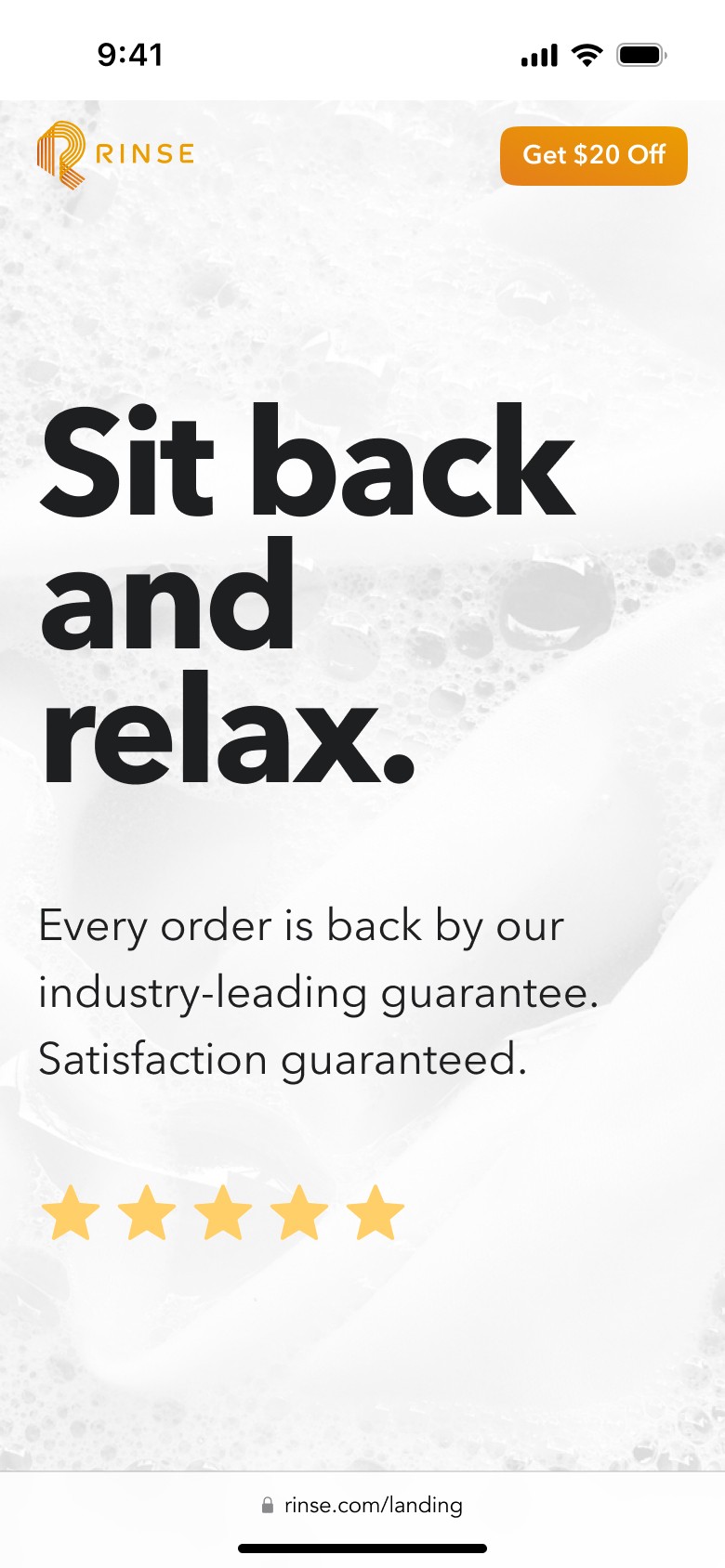
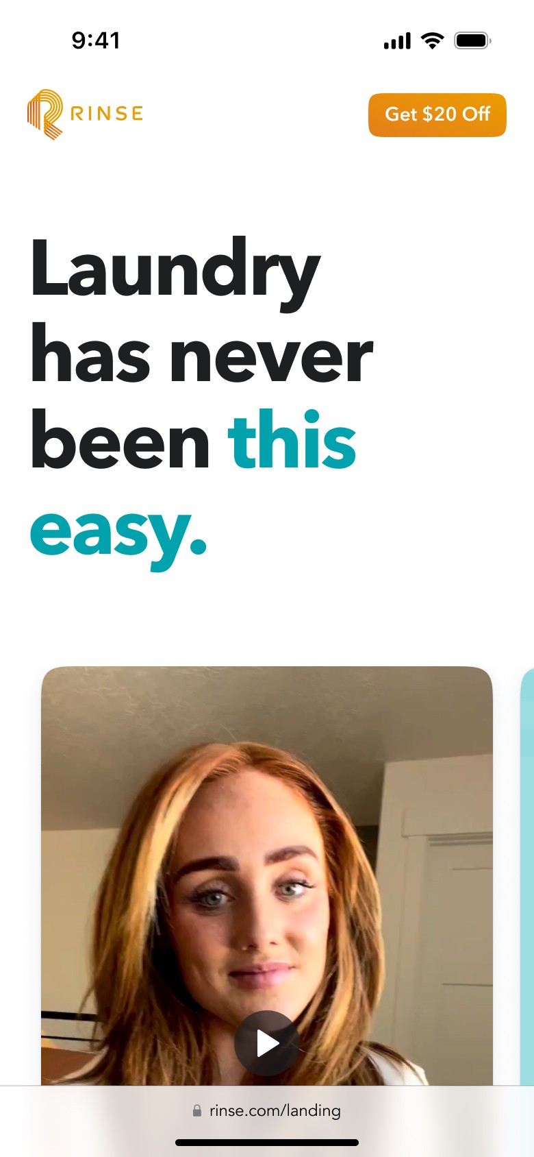
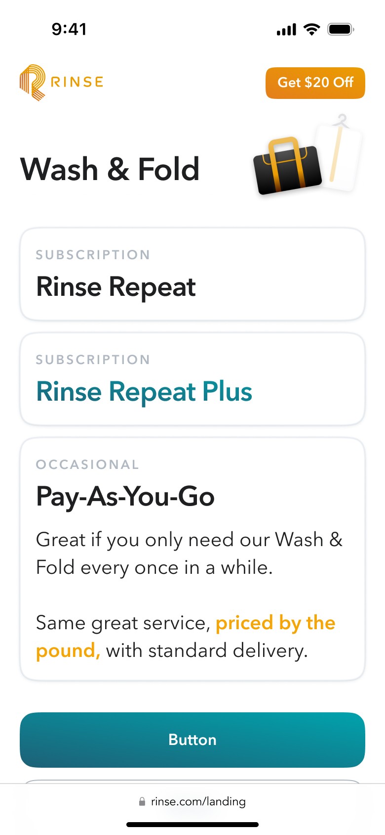
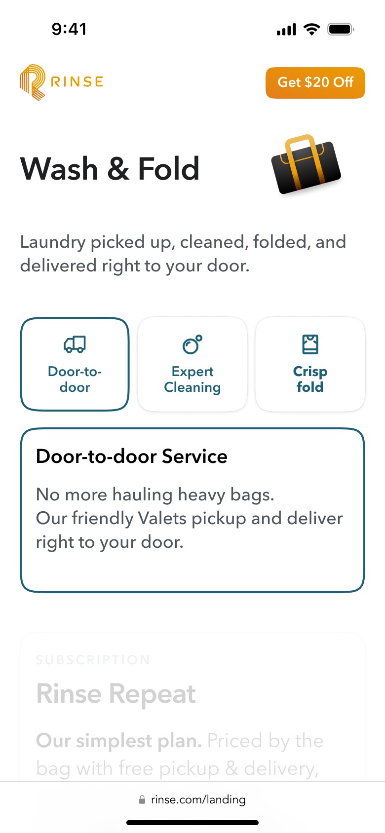
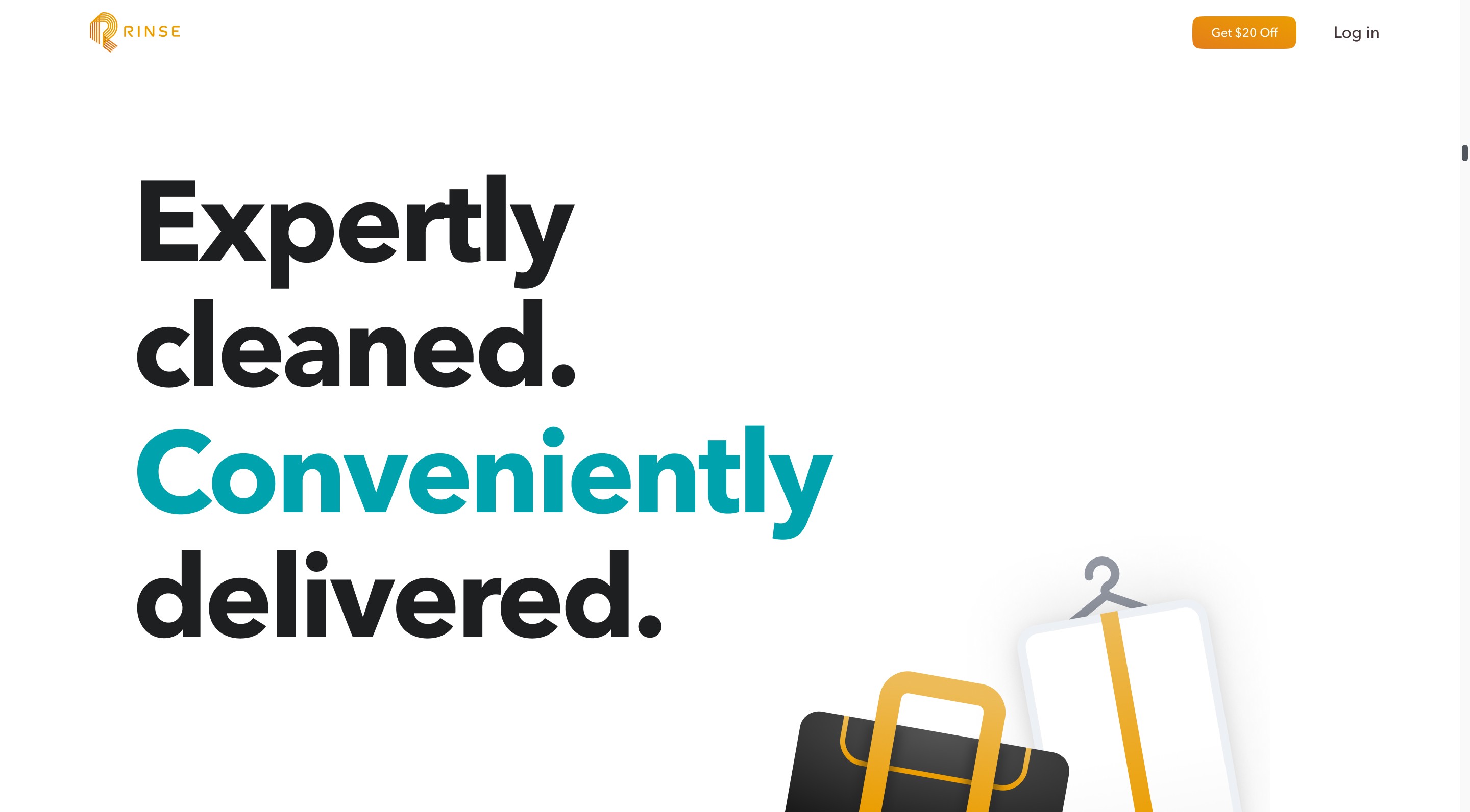
Since Rinse revamped the "Hero" section, we decided to retain this design element in our work. Given that most traffic comes from mobile devices, we prioritized the mobile approach from the start.
Throughout the project, we went through multiple iterations of content structure, guided by A/B testing metrics and discussions with the Rinse team.
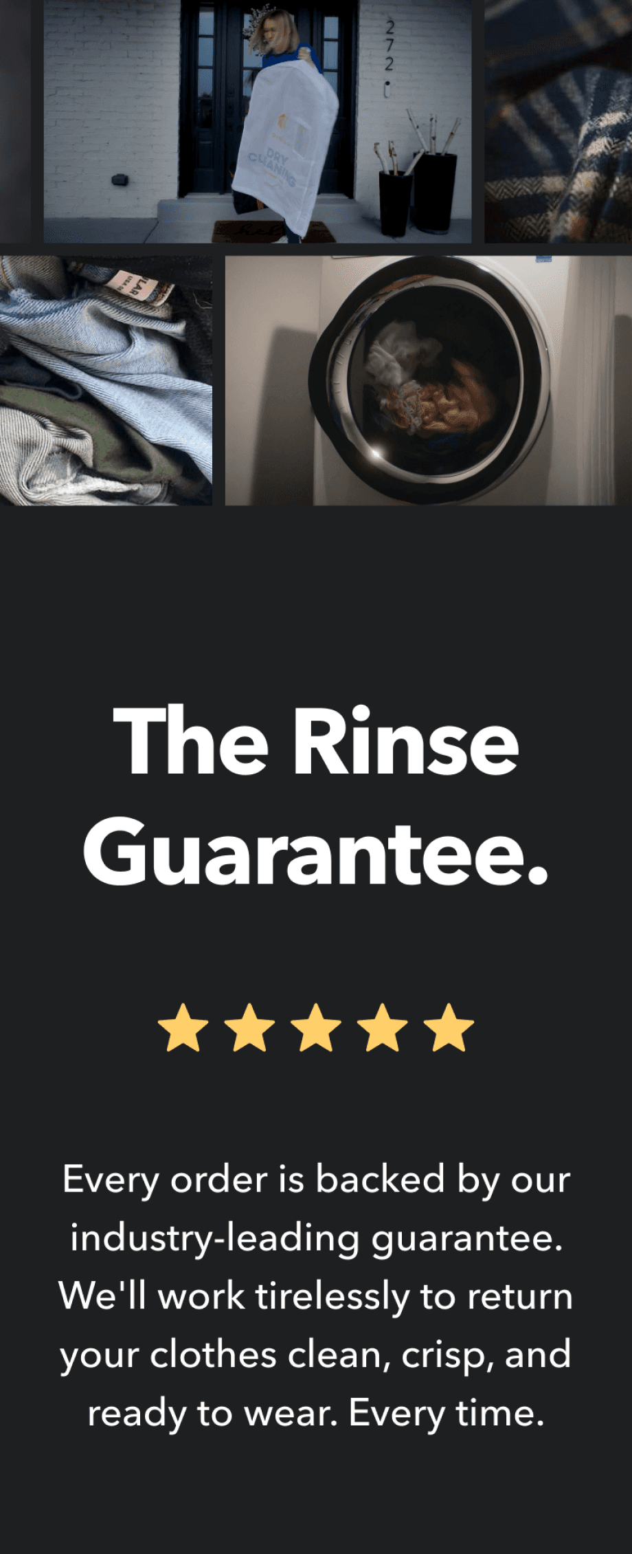
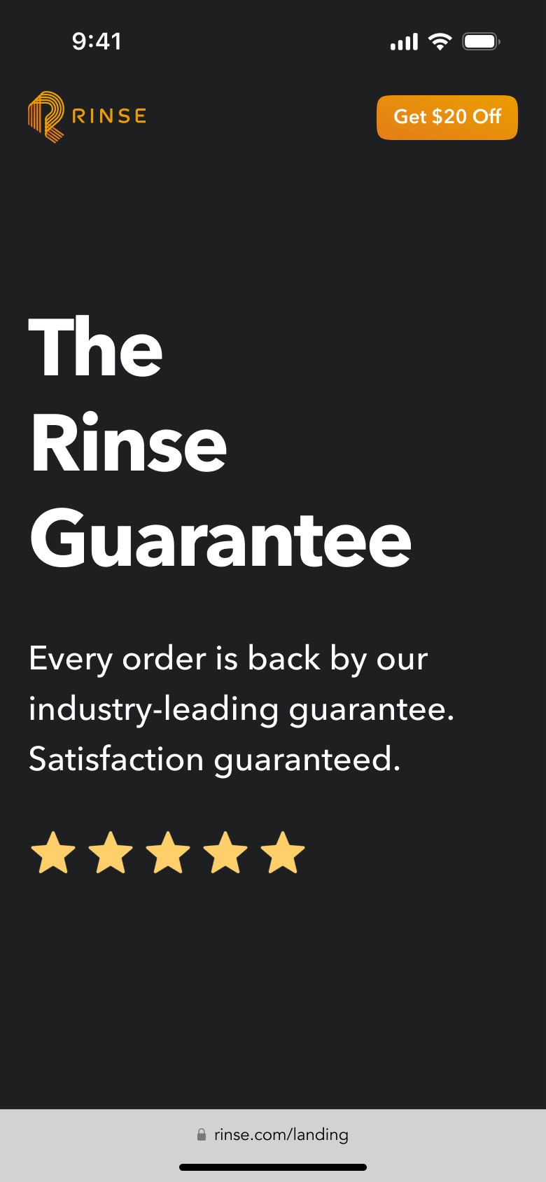
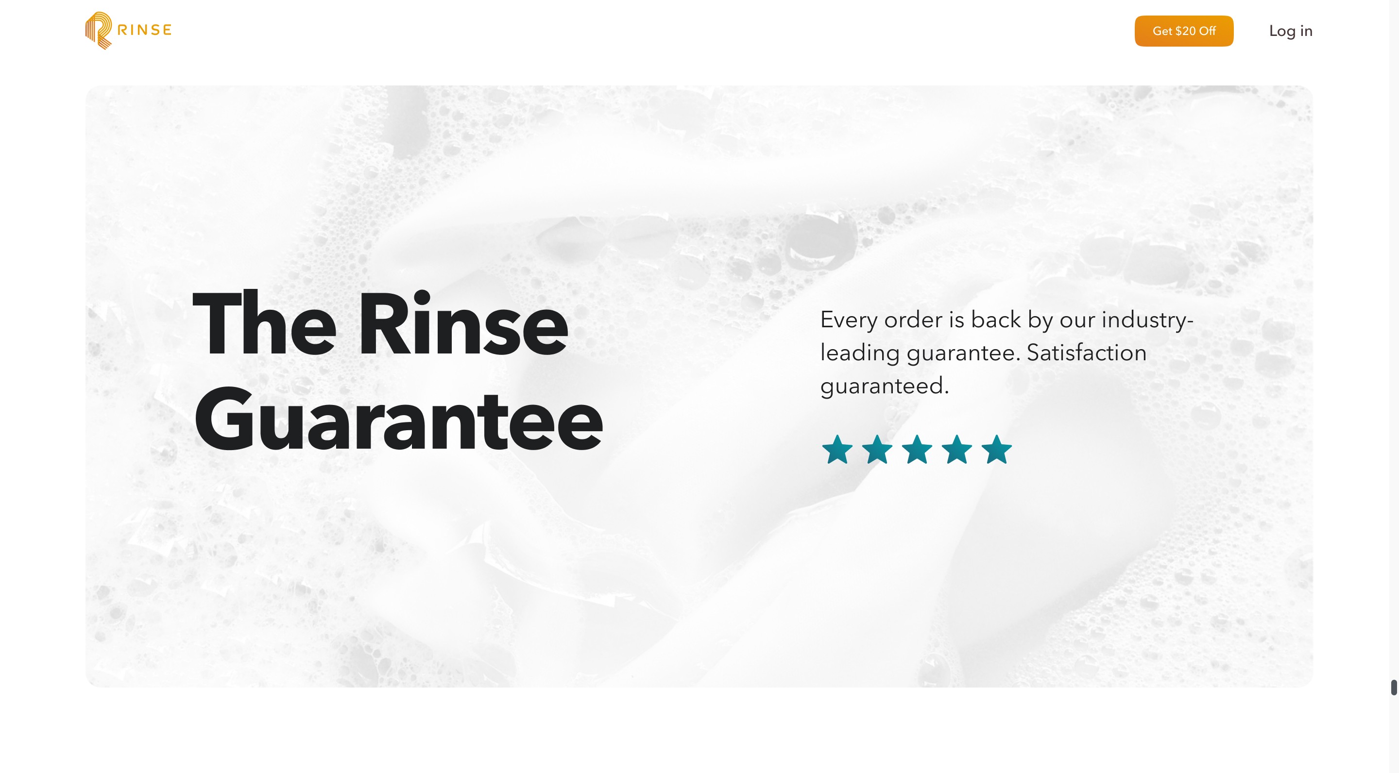
Our goal was to show essential information and reduce cognitive load, focusing on testimonials, reviews, and Rinse guarantee to streamline the decision-making process.
. Wireframing and iterations
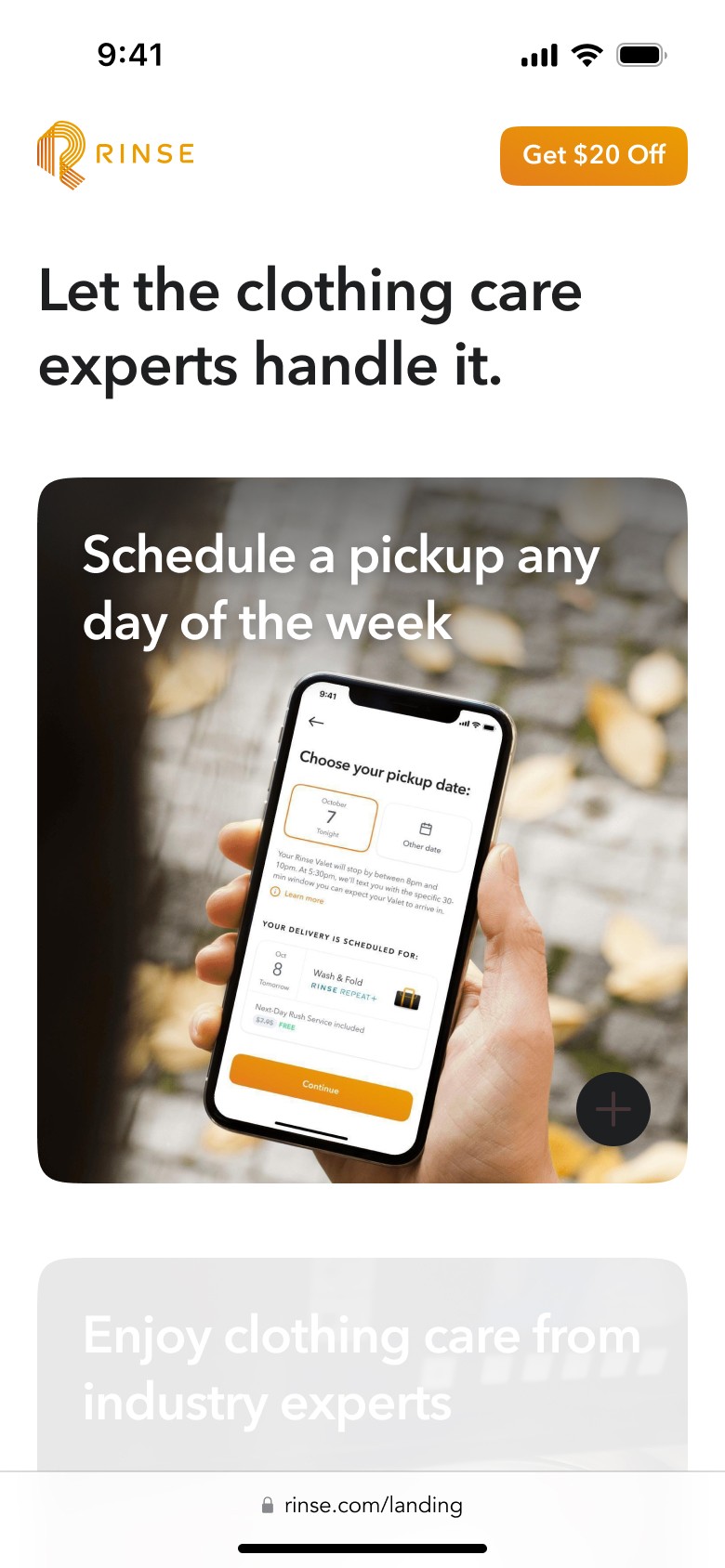
After finalizing the mobile content, we moved on to design the desktop version, adhering to the established guidelines. To align with the homepage, we chose a split scroll design for the services sections, which helps present content neatly and adds a visually pleasing effect to improve the user experience.
. Refinements
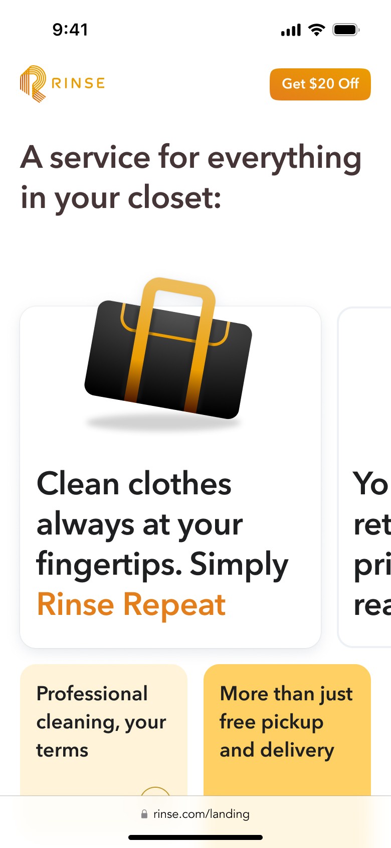
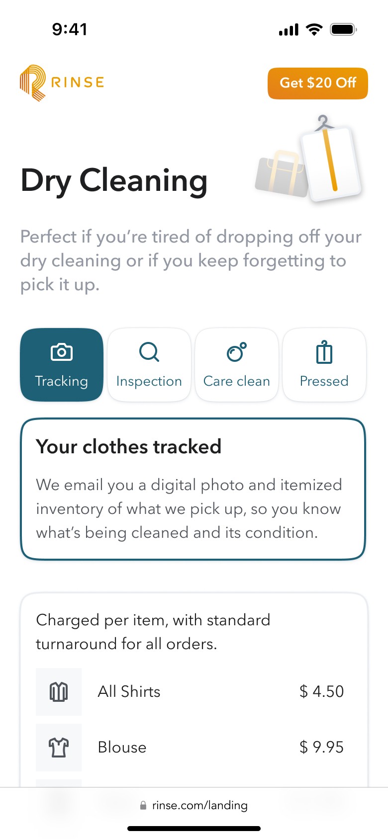
Through an iterative process, continuously refined by feedback from the Rinse team, we focused on a modular design to streamline content, reduce cognitive load, and highlight key information. This approach ensures users can easily identify Rinse’s most important services, improving overall accessibility.
Below, you can view the screens that underwent significant updates, showcased with a Before and After widget.
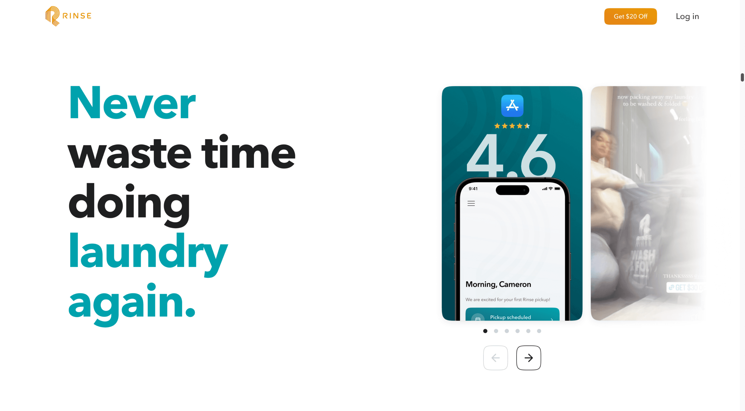
Hero
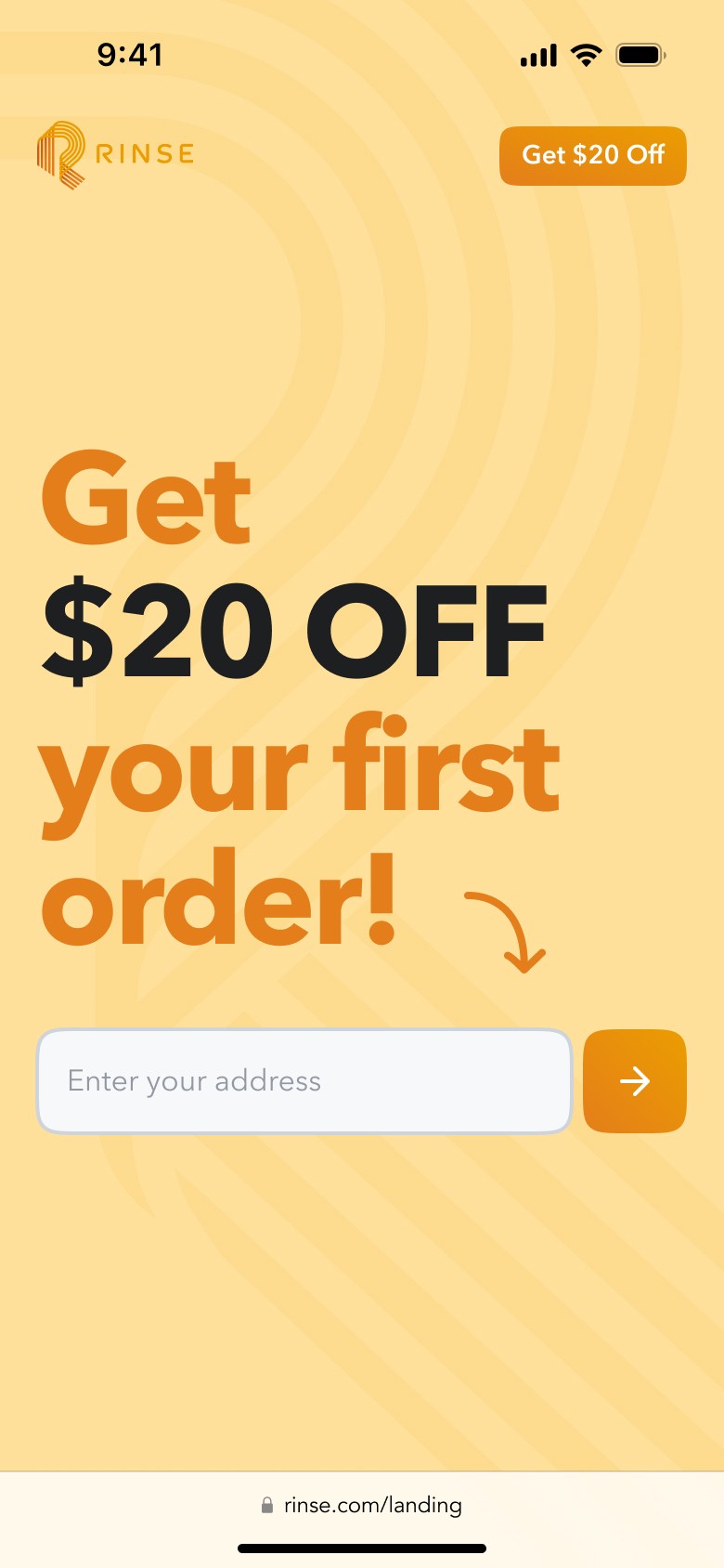
. The text content was changed and adjusted.
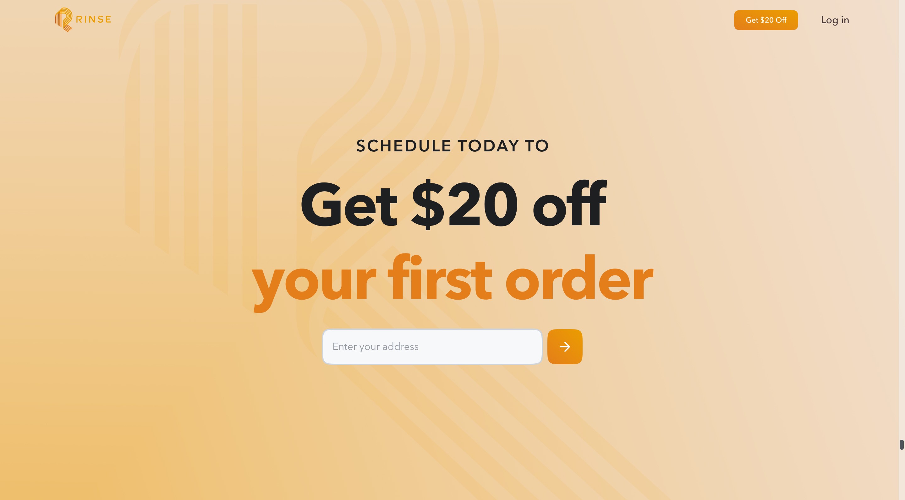
. The input field ask for an email instead of a zip code.
. App Store and Play Store reviews were integrated.
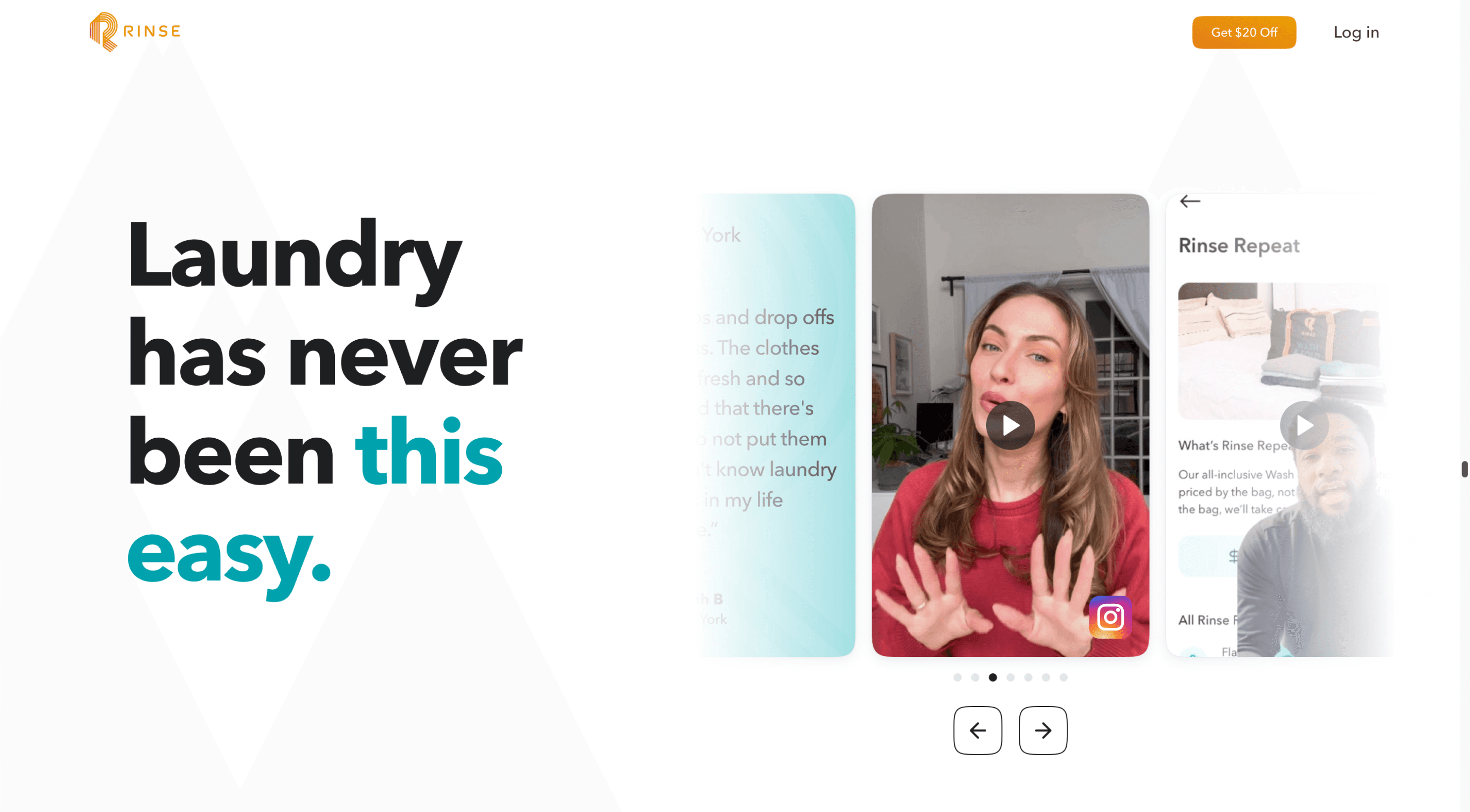
. The audiovisual carousel below the fold was removed.
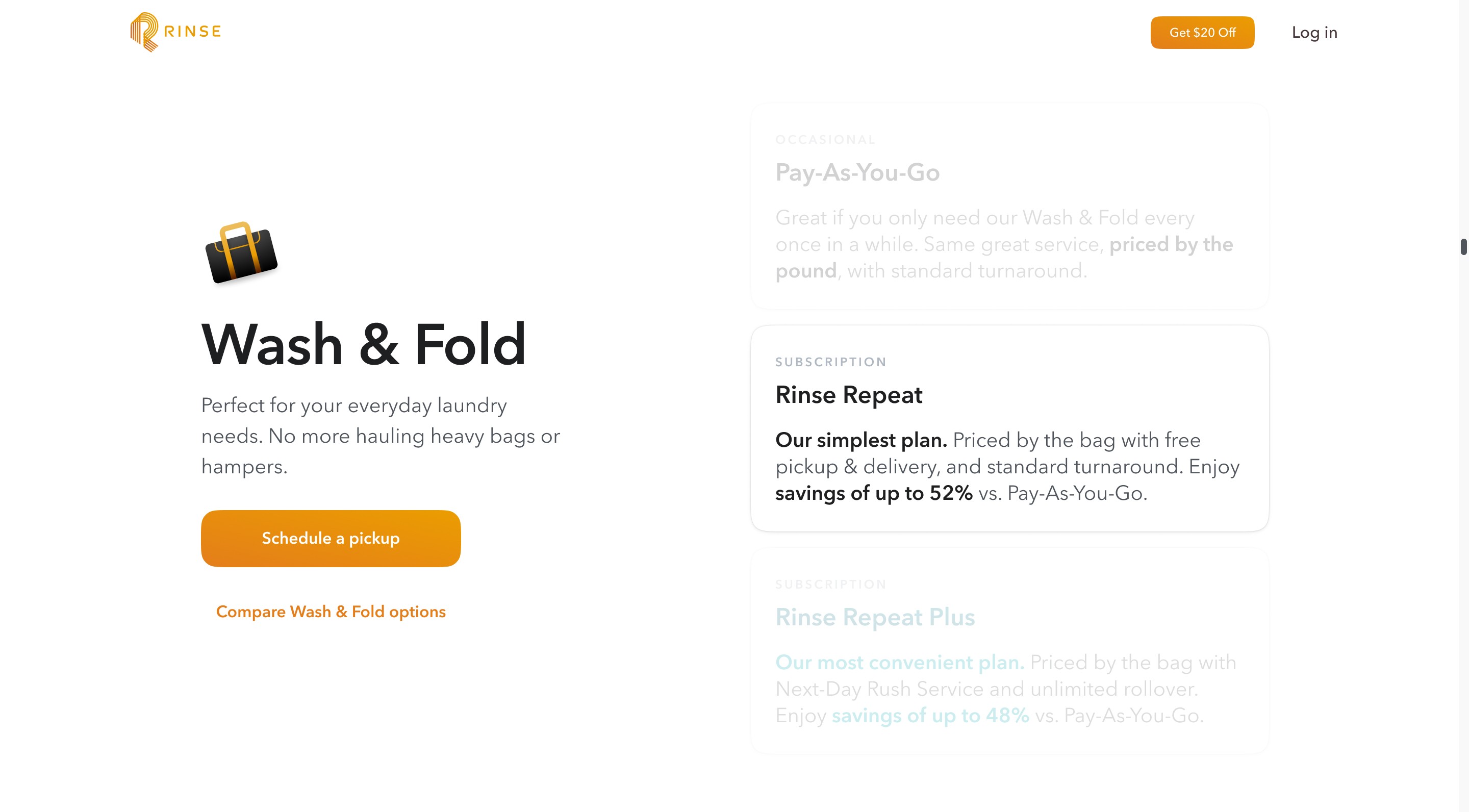
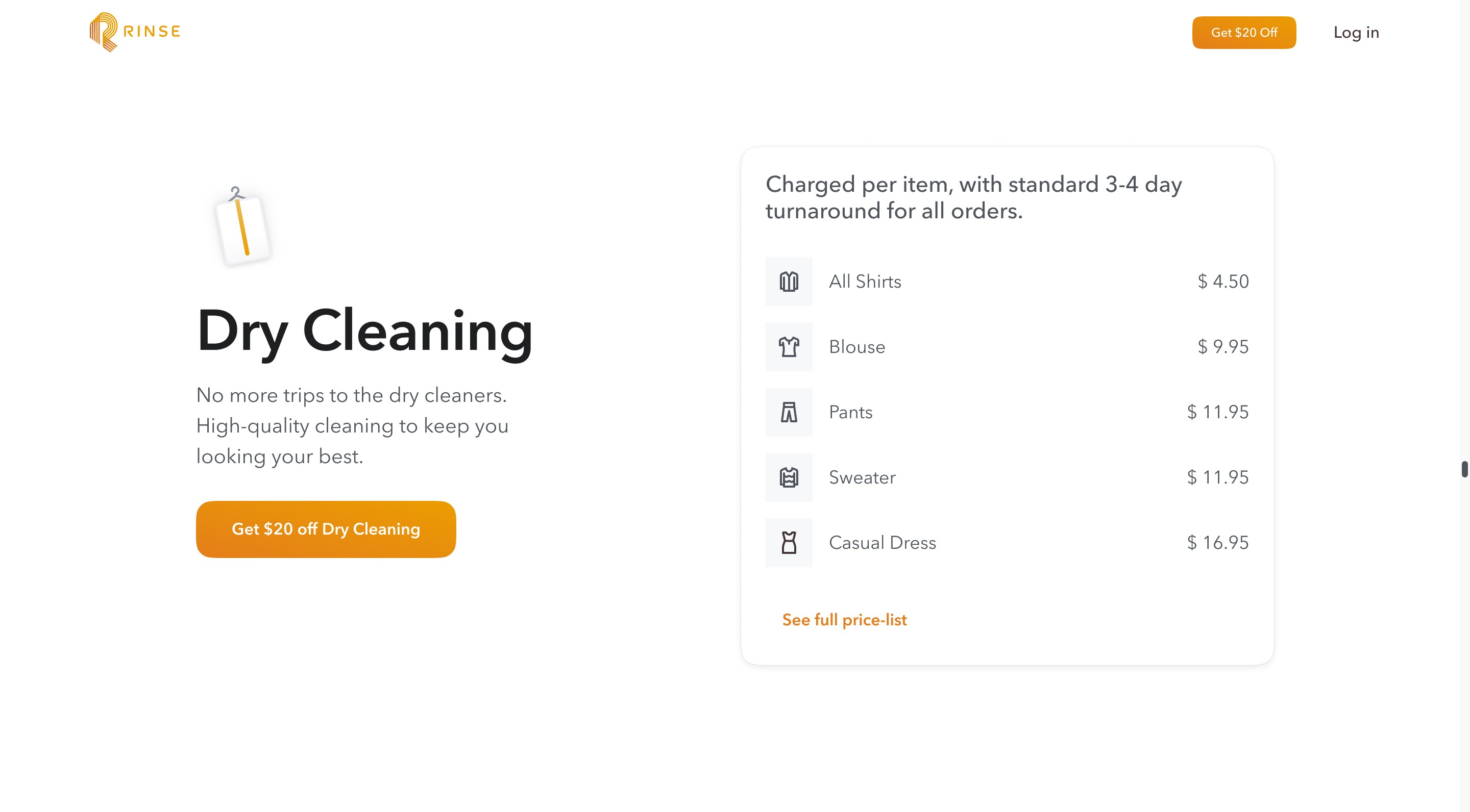
Services
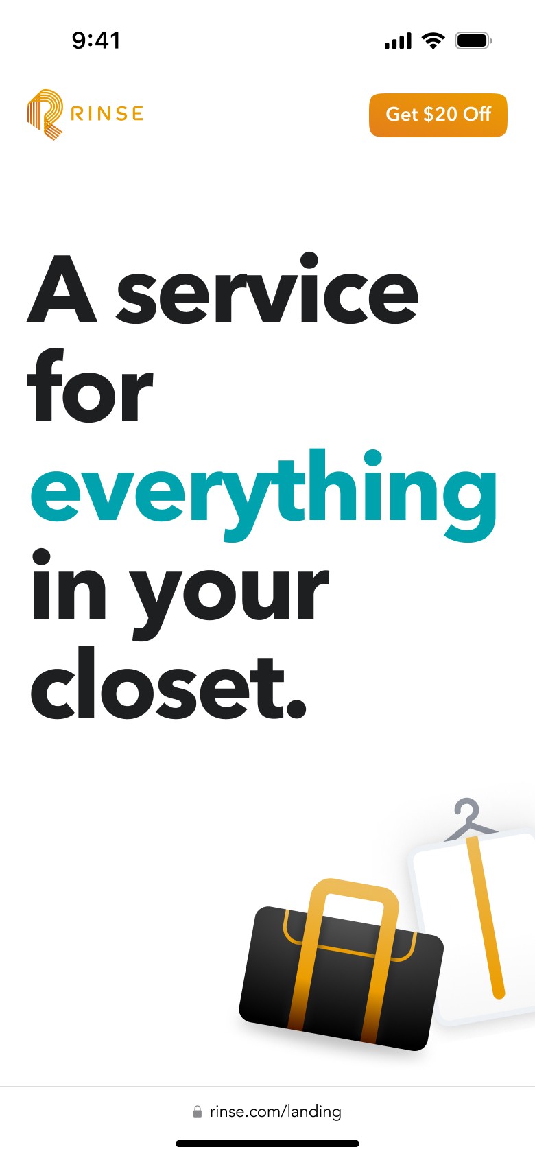
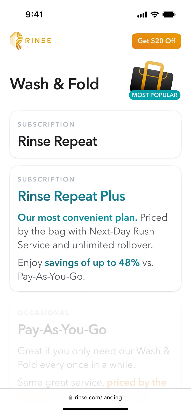
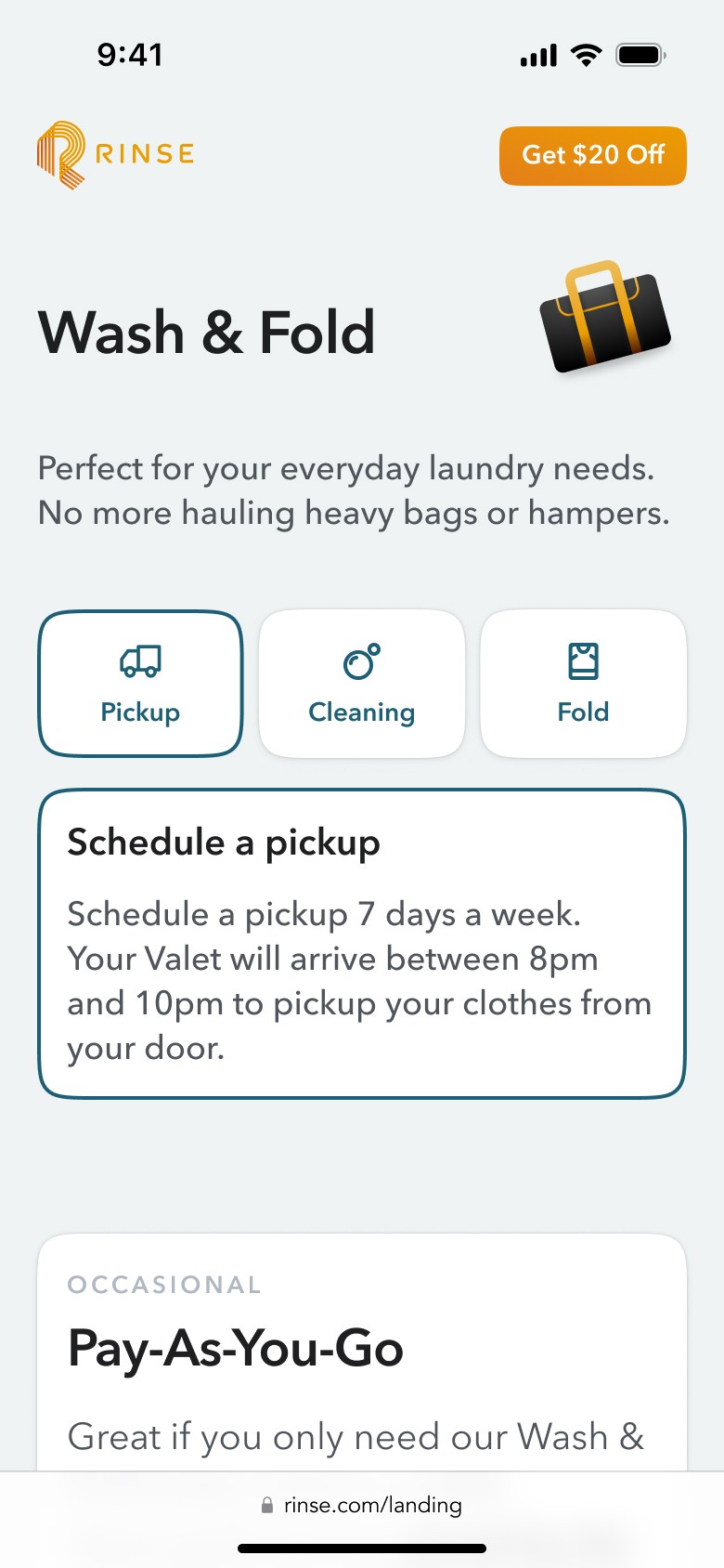
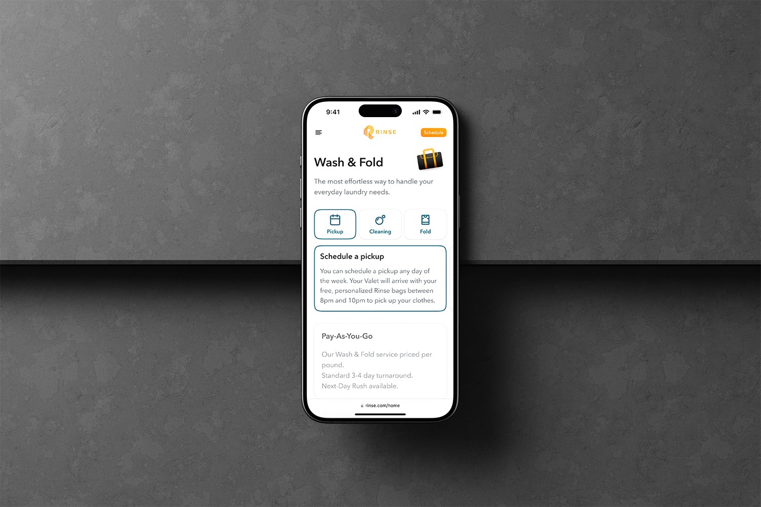
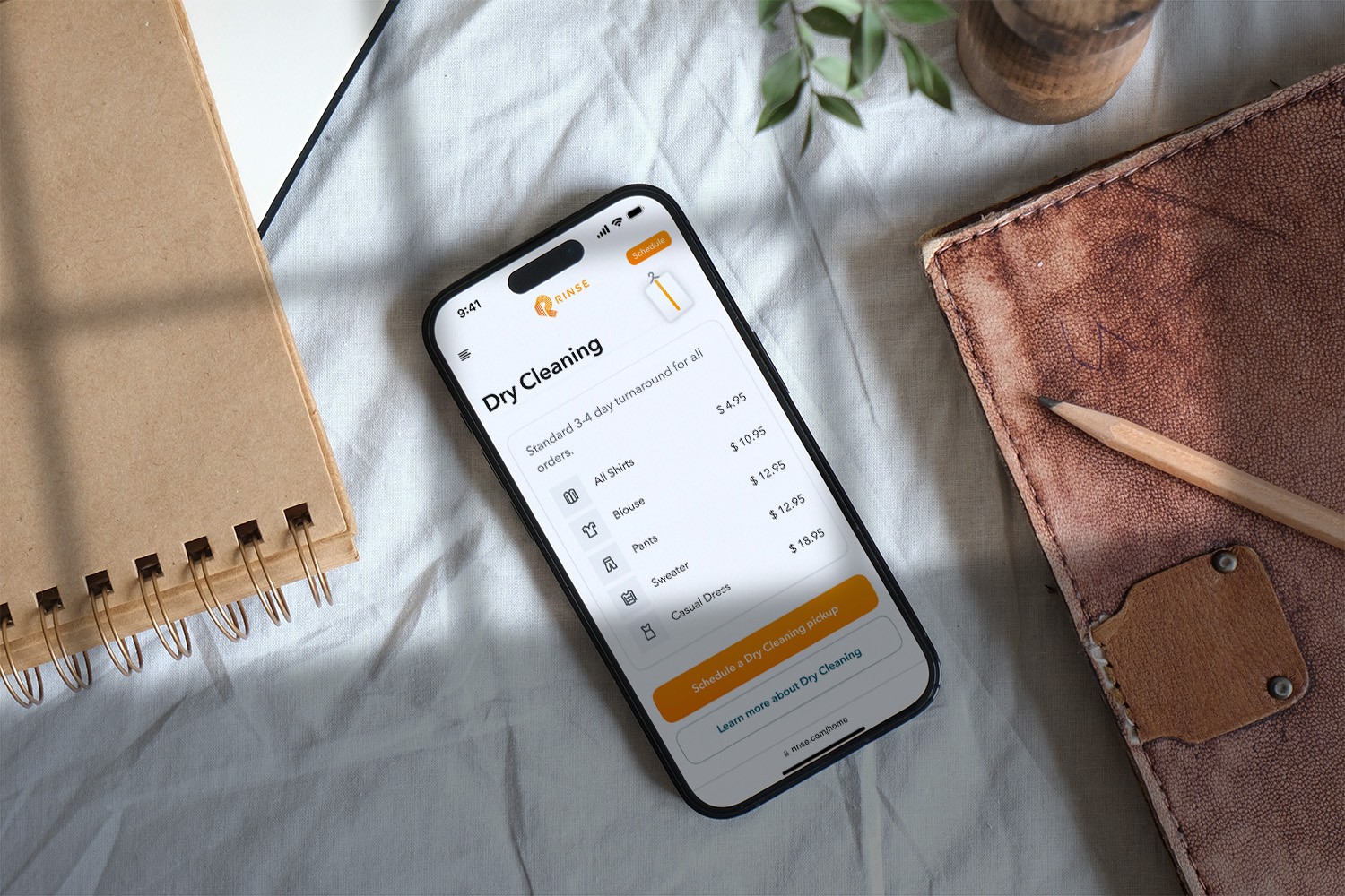
. Prices were removed, just leaving service benefits.
. A secondary button was added to subscription prices.
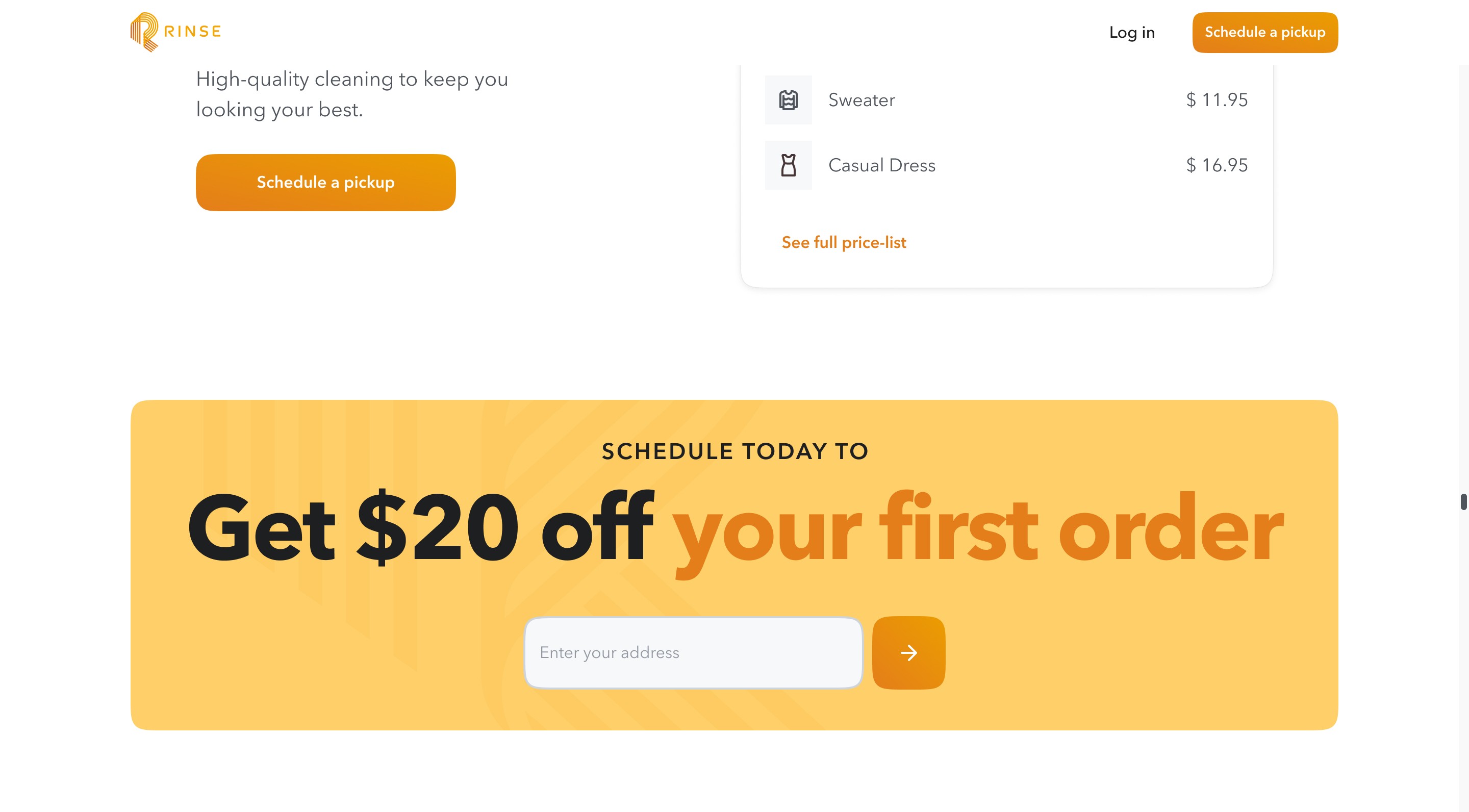
. The CTA appears on this second service screen.
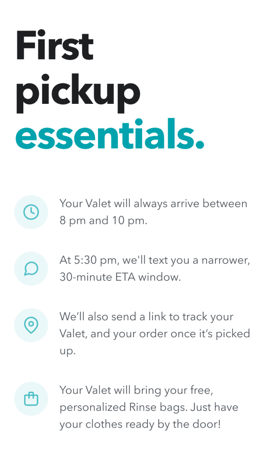
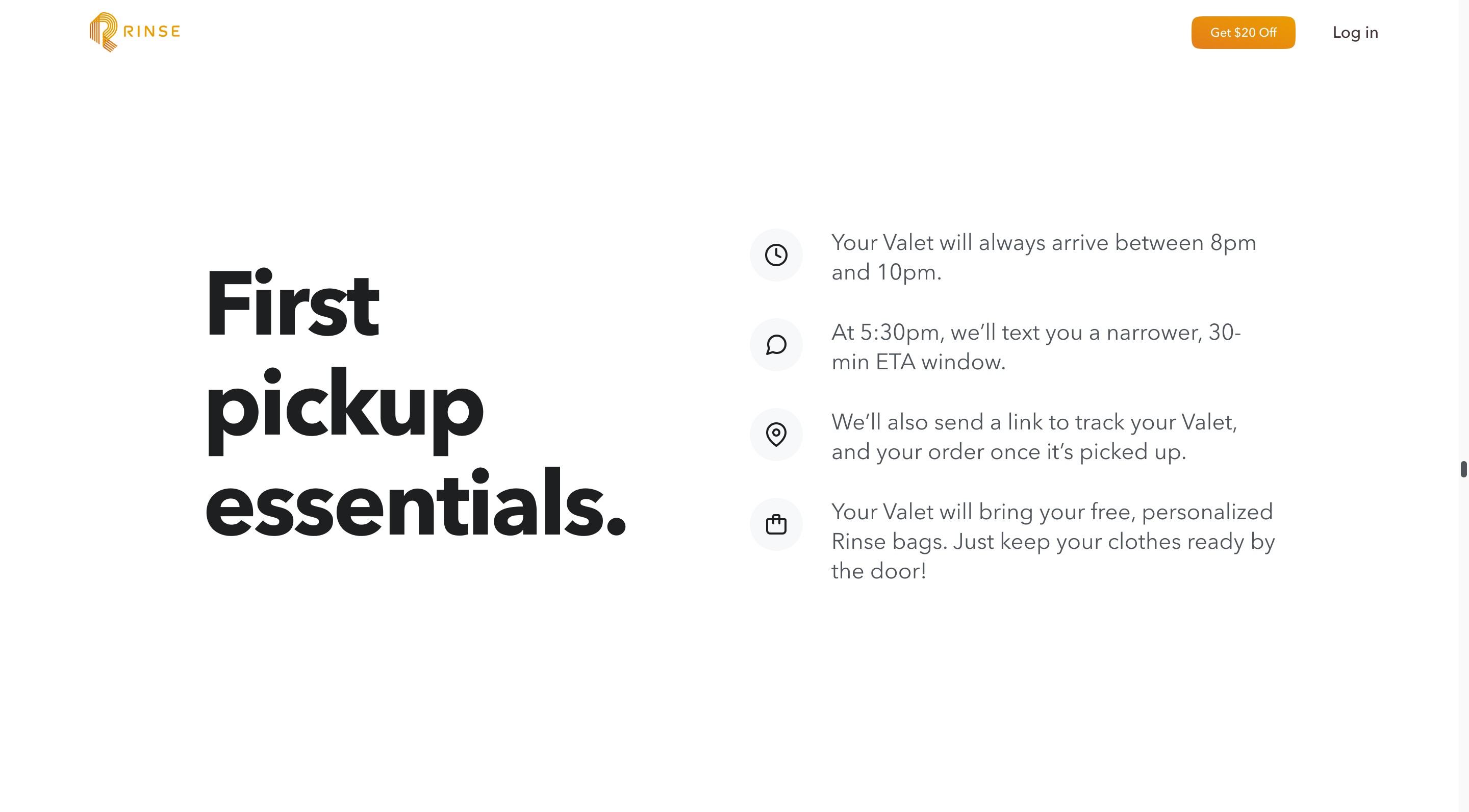
Pickup Essentials
. This section was moved after the services section.
. Icon colors were adjusted to be consistent with the App.
. The header copy was adjusted.
. Micro-interactions were applied while scrolling.
Testimonials
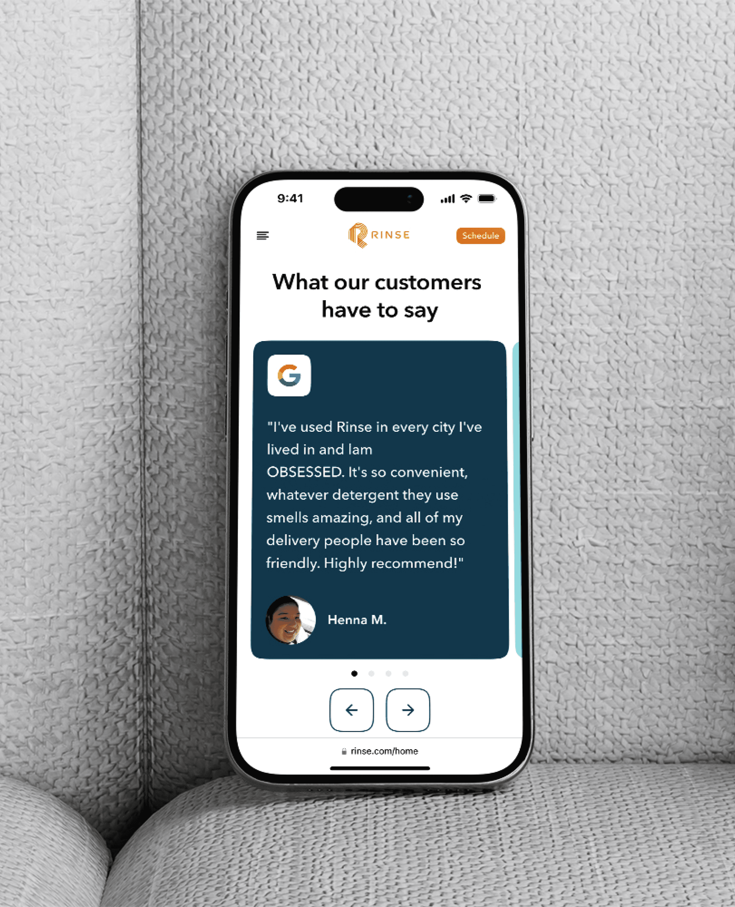
. The audio-visual testimonials Carousel was replaced by a section containing testimonials from download-only platforms.
. Landing for AdWords
With insights from the Rinse team and encouraging metrics, the refined landing page was completed and successfully approved.
. Homepage A/B testing
Throughout 2023, Rinse actively tested new features to improve the performance of its digital products. After achieving positive results with the updated AdWords Landing page metrics and aligning with ongoing initiatives, A/B tests were conducted with Rinse's homepage to determine the next steps.
For this test, we further updated and modified the AdWords Landing page to evaluate which version performed better with users.
. Improvements made
Audio-visual content was implemented for the hero and CTA as a trigger.
Images and videos were added to the Services and Essentials sections.
Copy updated in nearly all the sections of the landing page.
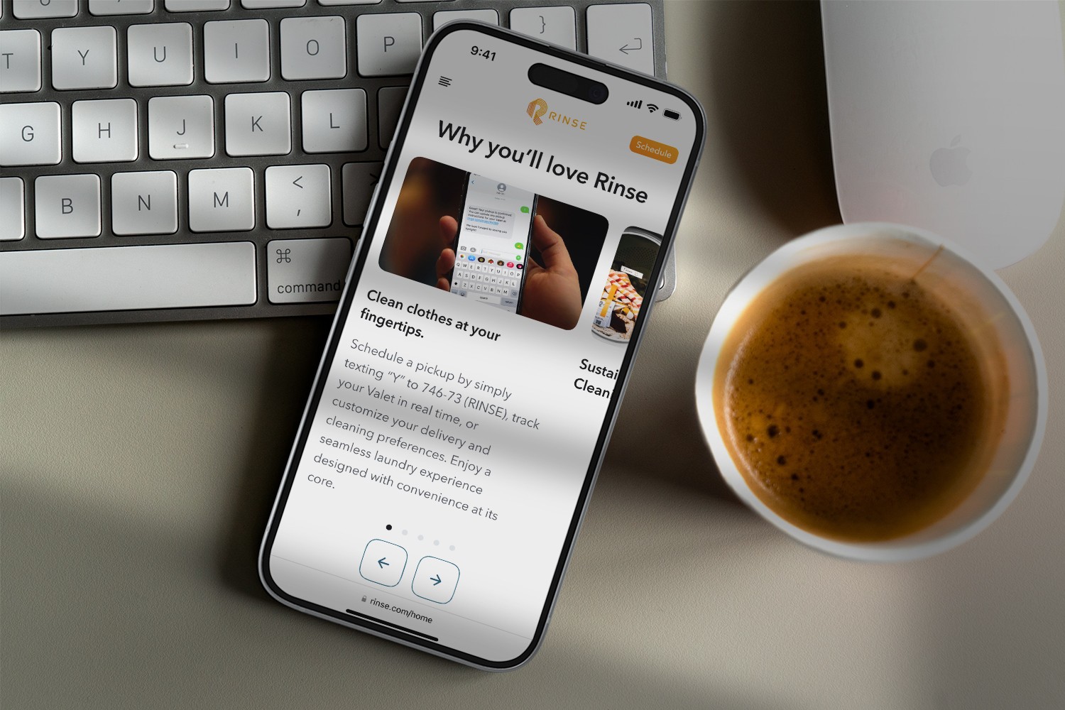
Added "Why you'll love Rinse" section with positive information.
. New Rinse Homepage
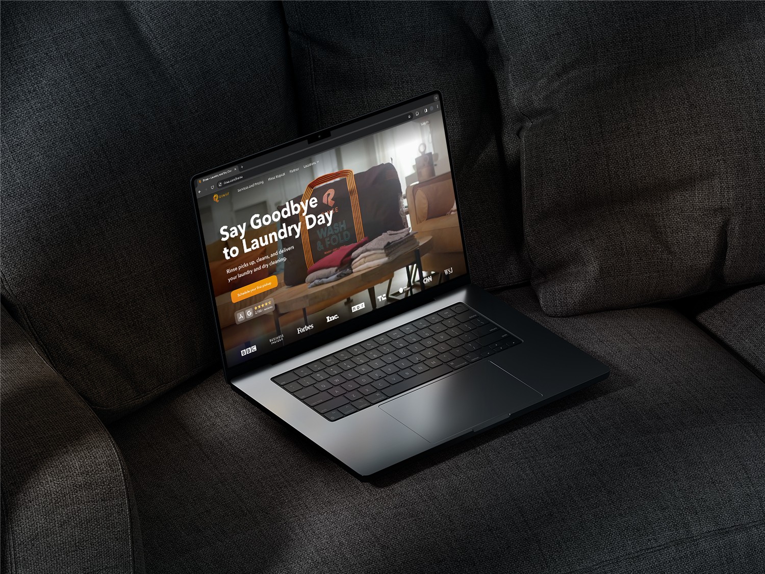
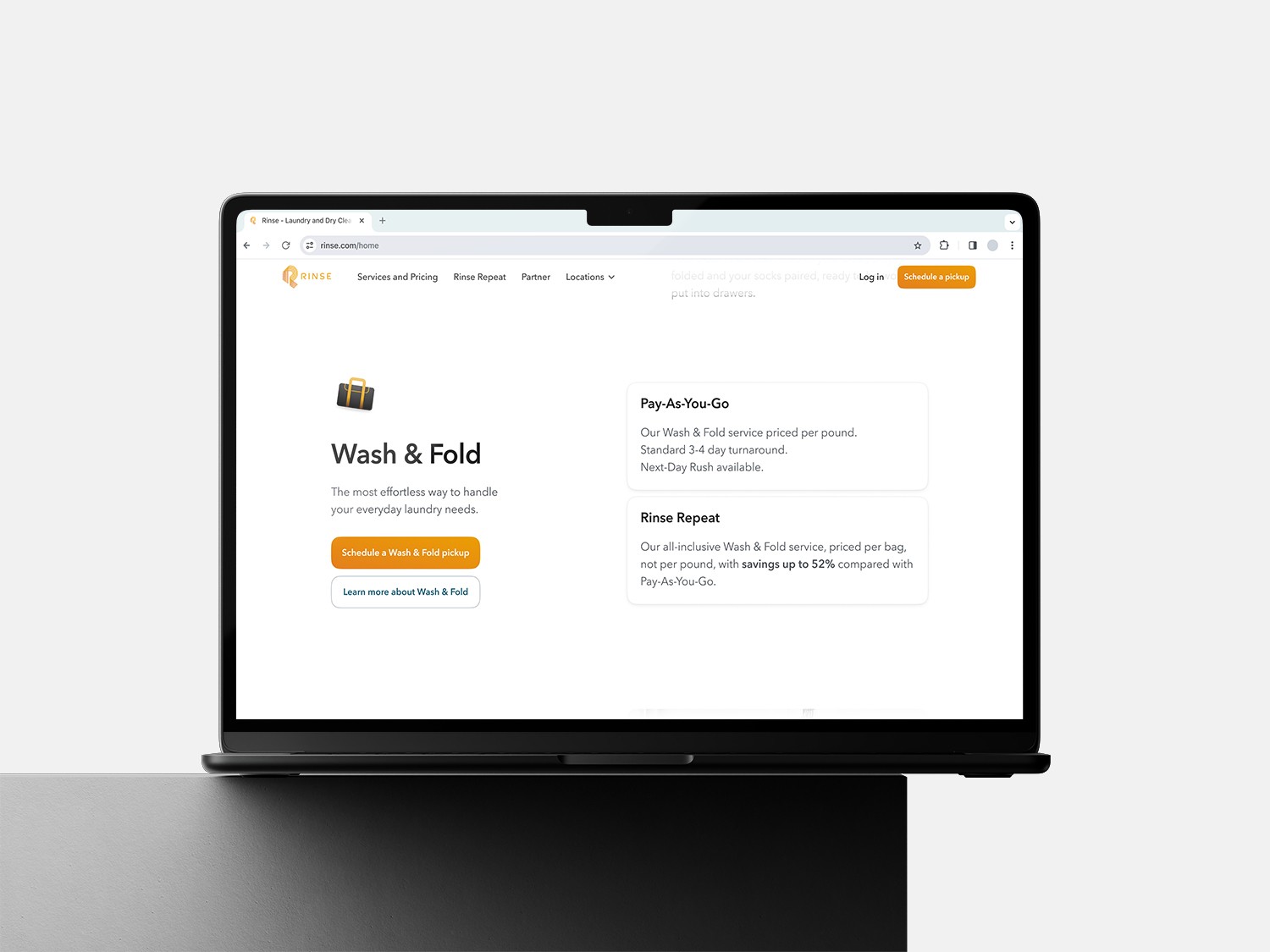
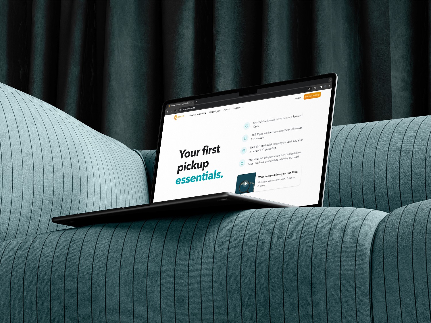
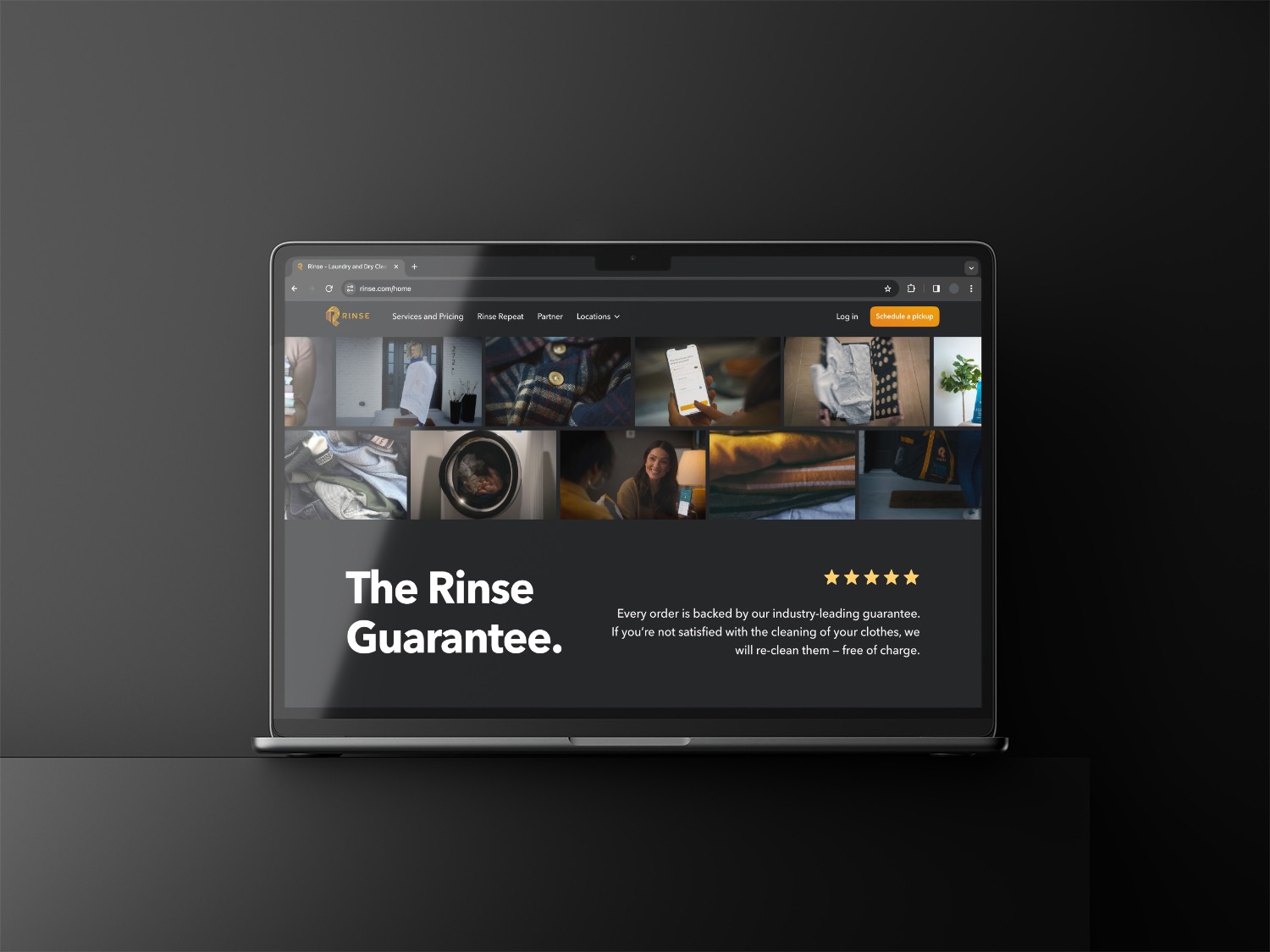
Finally, the updated landing page outperformed the current homepage in the A/B test, showing improved performance, increasing customer conversion by +22%.
The project that began with the development of a Landing page for AdWords campaigns, evolved through cross-team discussions, multiple A/B tests, and iterations to finally become the new Homepage for Rinse.
. Conclusion
In short, I want to highlight the great synergy and the value of teamwork in this project between our design team at Lunte Studio and our client, Rinse. We achieved our main goals of improving conversion and reducing CAC, thanks to visual, structural, and content changes that offered a clearer and more focused experience for users.
On a personal level, this project allowed me to dive into the complexities of the business, strengthening my interaction with the client and the development team. I also had the chance to apply and refine my skills as a digital product designer, always aligned with the client's needs and the changes that came up. I’m grateful to have been part of such a talented and dedicated team.
