Process and Approach:
01 _ Understanding
. Business needs
. Problem statement
. Challenge
. Insights
02 _ Design Path
. Starting Point
. To Be Done
. Style and Detail Alignments
03 _ Final Delivery
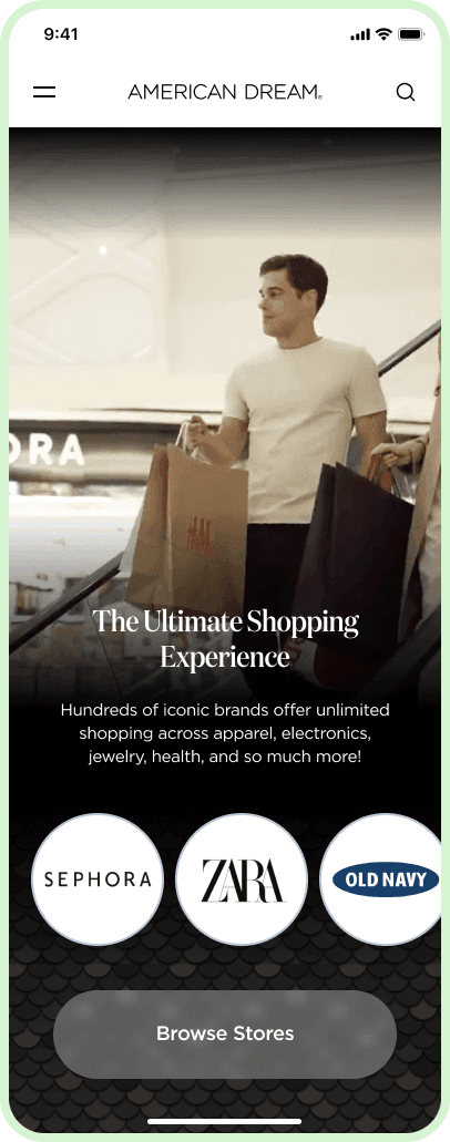
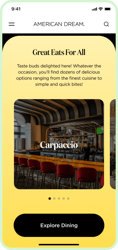
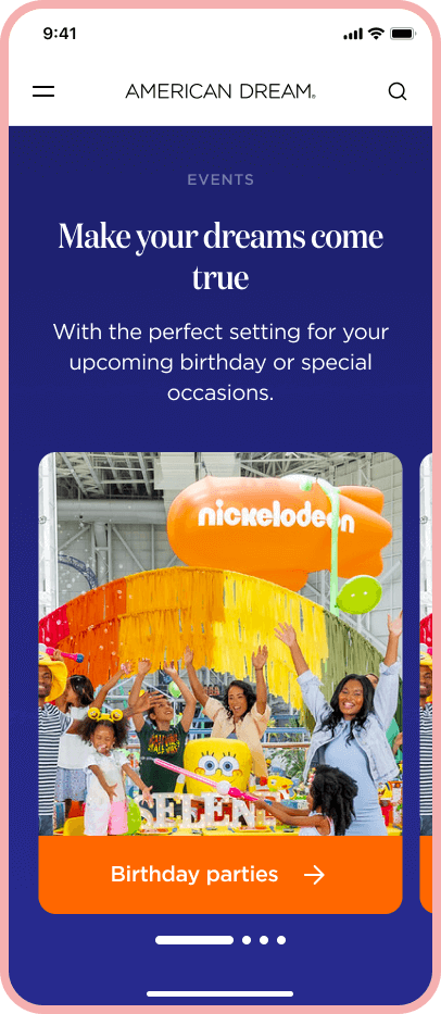
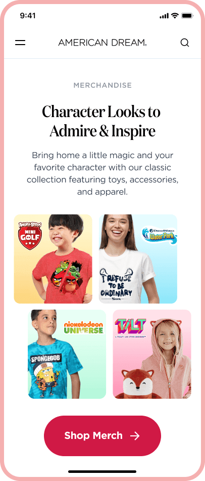
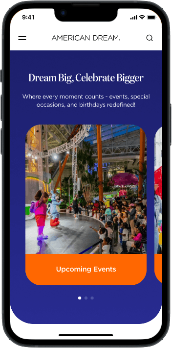
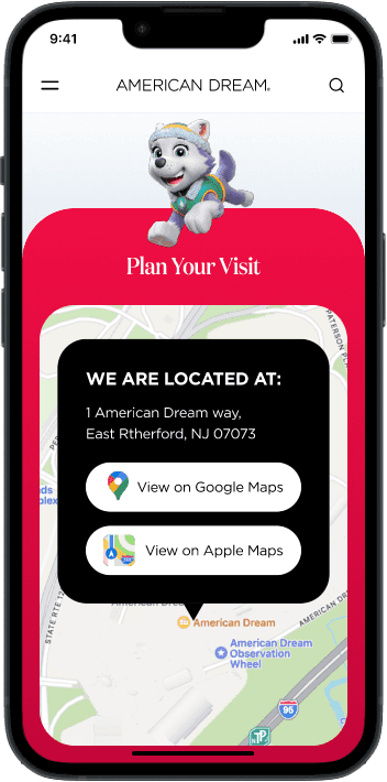
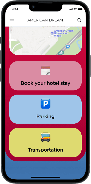
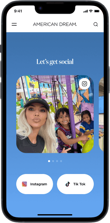
. Prototypes and Mockups
. Conclusion
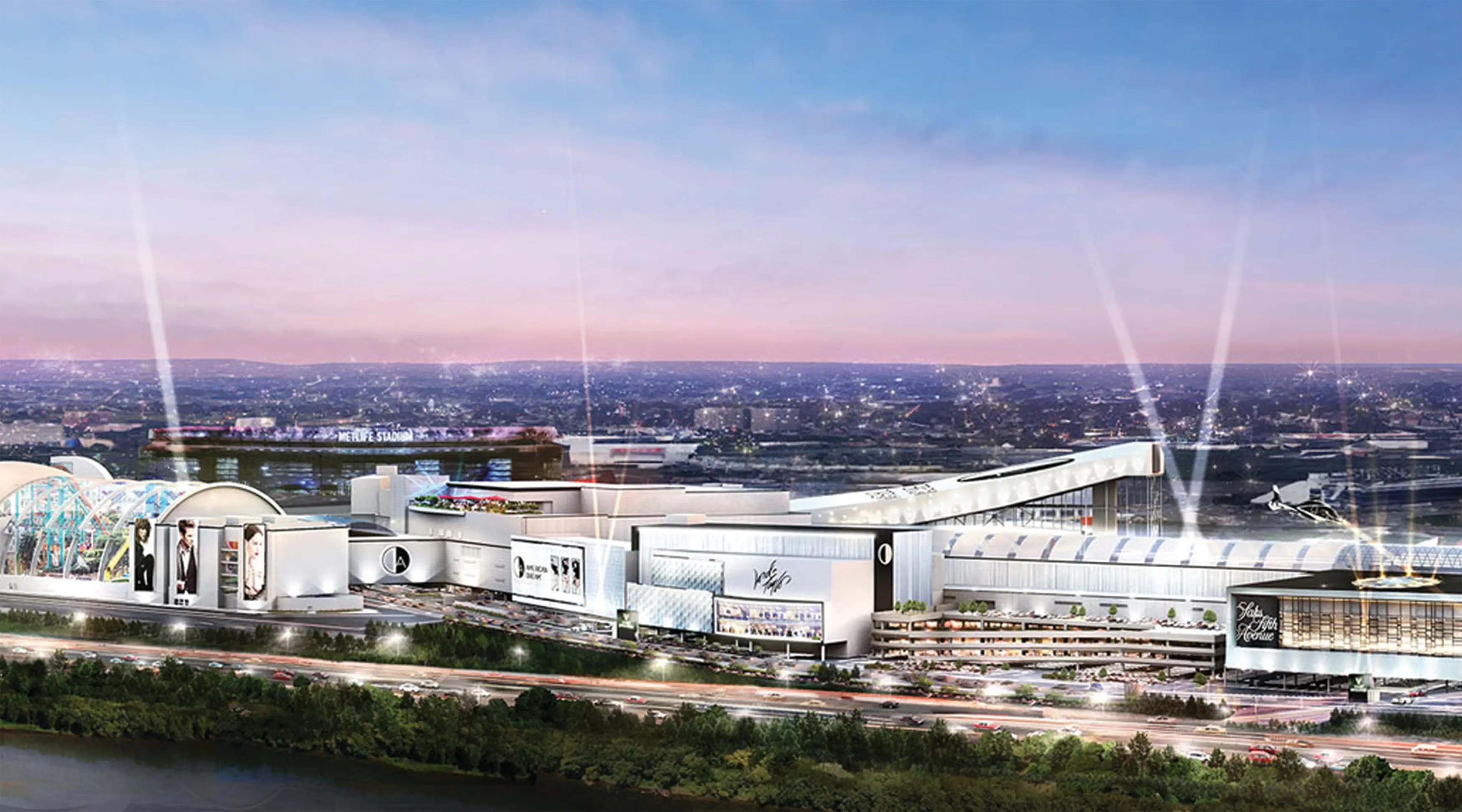
American Dream in New Jersey is a major entertainment and retail complex featuring an indoor theme park, water park, ski slope, and over 450 retail stores, including luxury boutiques.
Its website serves as the main platform for visitors to explore available activities, shops, dining options, events, and to reserve or purchase tickets.
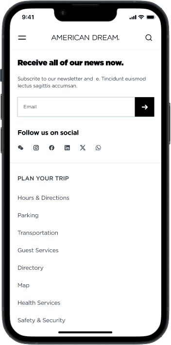
In 2023, the homepage was updated and redesigned but lacked animated elements and micro-interactions. This project aimed to enhance the user experience by adding and refining these interactive elements, adjusting overall details, and strengthening the visual style of the homepage.
. Business needs
Enhance the website's user experience within a four-week timeframe, ensuring it is both highly functional and engaging for users.
. Problem statement
The website does not provide adequate feedback, preventing users from feeling confident and enjoying their navigation experience.
. Challenge
Minimize cognitive effort and provide feedback to ensure an intuitive and play-full navigation experience for users.
From a design and UX perspective, our focus was on streamlining content and enhancing usability.
. Benchmark Insights
Enhancing user confidence through effective feedback.
Improving navigation flow and content attractiveness.
Guiding users with intuitive cues for enhanced interaction.
Decreasing cognitive effort in user interactions.
. Starting Point
Having launched the American Dream homepage, our next step was to add and implement micro-animations to infuse a playful touch into the site.
. To Be Done:
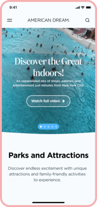
Add splash hero video animation.
Implement hover effects on desktop buttons.
Add while pressing effects for desktop and mobile buttons.
Animate components and sections as they appear in the viewport.
Develop a secondary nav-bar.
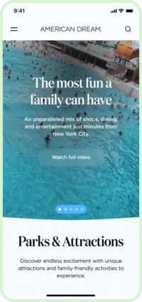
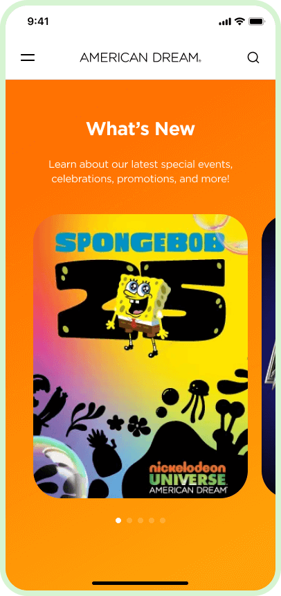
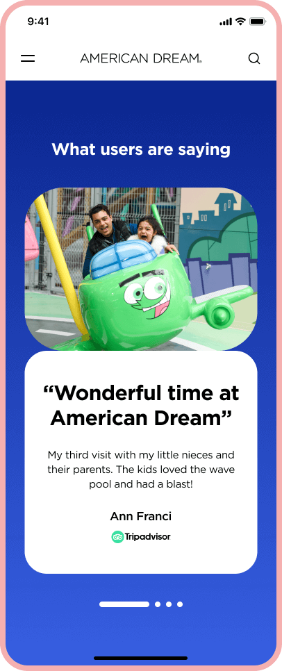
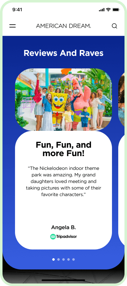
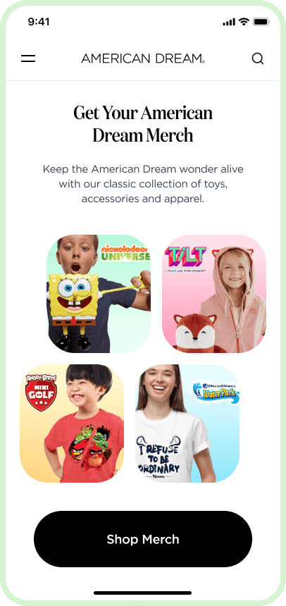
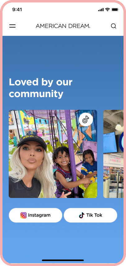
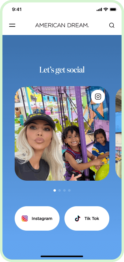
Align typographic styles and radii in container boxes/cards.
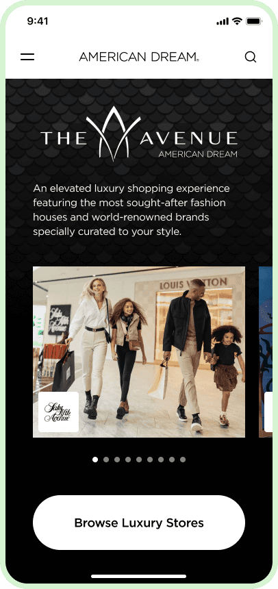
Update the Luxury Brands section.
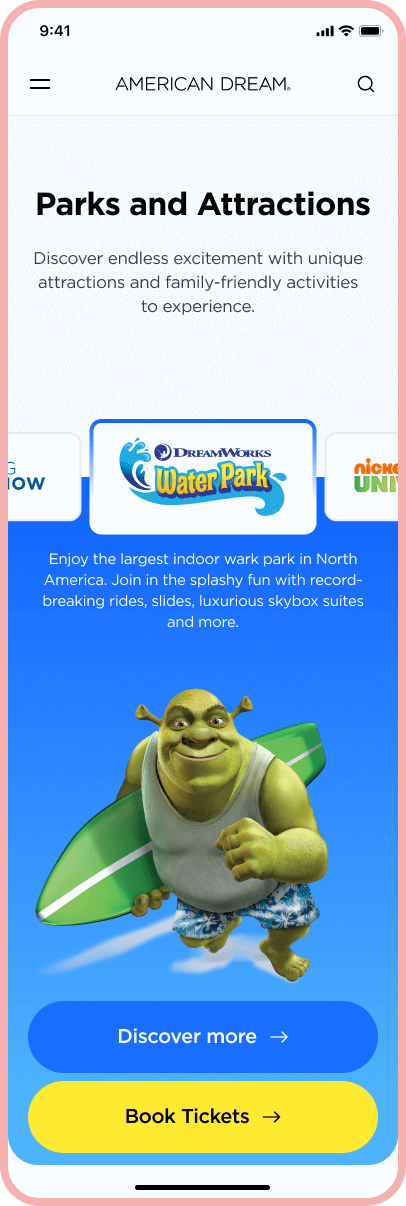
Enable horizontal scrolling or dragging for cards on mobile.
Update copy in multiple sections.
. Style and Detail Alignments
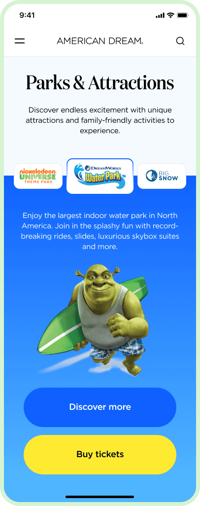
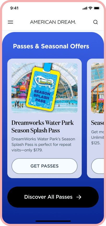
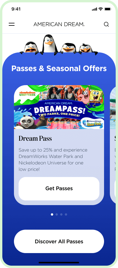
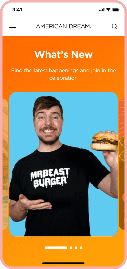
In preparation for adding micro-animations, we conducted a comprehensive review to achieve visual consistency on the homepage.
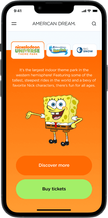
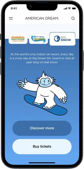
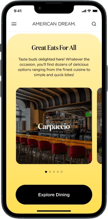
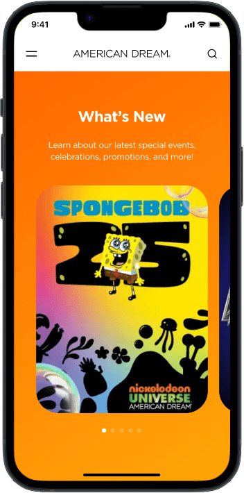
The following are the slight changes and adjustments that were carried out.
. Prototypes and Mockups
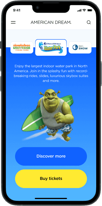
Thanks to a swift iterative process with Lunte team and the prompt, detailed feedback from American Dream team, we incorporated micro-animations and design refinements that led to a final product with improved user interactivity.
We have effectively upgraded the website to meet business needs and goals. By reducing cognitive effort and incorporating intuitive cues, we delivered an engaging and user-friendly experience.
. Conclusion
In short, we achieved our main goal of improving the website experience within the deadline by applying micro-interactions and tweaking visual details.
From a personal perspective, this project was an interesting challenge, as it was approached mainly from a visual point of view, but without neglecting usability.
